Category
Web & UX
Web, UX, and performance for free tools: why “no signup, no upload, free forever” is an architecture decision, how to make a browser tool feel instant, and resisting feature creep.
18 articles
About the Web & UX thread
"No signup, no upload, free forever" reads like a marketing line and is actually an architecture decision. If processing happens on the user's device, there is no per-use server cost, so there is nothing to meter, so there is no reason to build an account system. The product promise falls out of the technical choice rather than being layered on top of it, and this cluster is largely about that relationship.
The rest is performance and restraint. A browser tool competing with installed software has one advantage (it starts instantly), and squandering that on a heavy bundle forfeits the whole case. The articles on feature creep and on what makes a tool worth bookmarking are the counterweight: most requested features make a tool worse for the people already using it.
What this topic covers
- Why no-signup, no-upload is an architecture decision rather than a pricing one
- Making a browser tool feel instant: bundle discipline, perceived performance, and first paint
- Resisting feature creep, and how to decide what not to build
- Forms that do not frustrate: field-tested rules
- Analytics for a small site without invasive tracking
Who it's for
Product engineers and designers building tools, and anyone deciding what a free web app should and should not do.
18 articles in this thread, newest first. Every one is free to read with no signup.
18 articles in this thread
Web & UX · Jul 27, 2026
What makes a browser tool worth bookmarking?
A practical quality checklist for deciding which online tools deserve a permanent place in your workflow.
Field notes
Web & UX · Jul 16, 2026
Analytics for a small site without invasive tracking
A decisions-first approach to small-site measurement: which questions justify collecting data at all, server logs versus client scripts, the cookieless middle ground, honest interpretation at low traffic, and the consent-gated GA4 configuration we actually run.
Novus Stream Solutions (hub)
Web & UX · Jul 9, 2026
Forms that don't frustrate: field-tested rules
Practical form design rules earned from watching people stall: label placement, validation timing, error wording, mobile keyboards, and when to skip the form entirely.
Novus Stream Solutions (hub)
Web & UX · Jul 8, 2026
Accessible color systems for dark UIs
A working color system for dark interfaces: WCAG contrast on dark backgrounds, accent discipline, state design, and the testing that keeps it honest.
Novus Stream Solutions (hub)
Web & UX · Jun 18, 2026
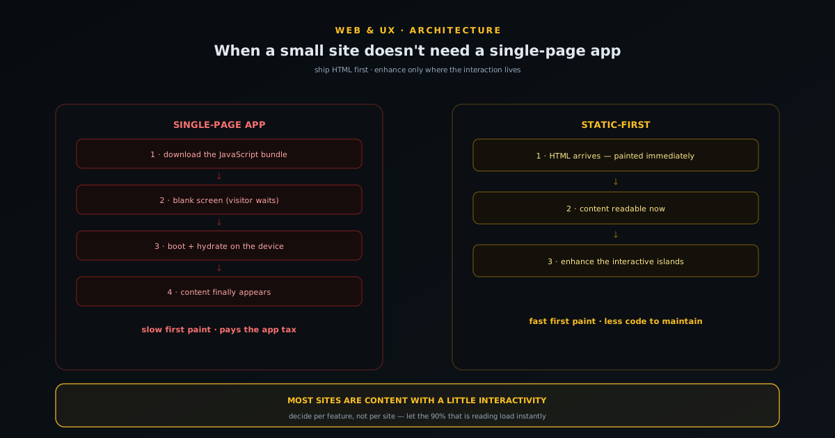
Static-first: when a small site doesn't need a single-page app
A plain-English case for building static-first instead of reaching for a single-page app by reflex: what a SPA actually costs in load time, complexity, and fragility; why most small sites are content with a little interactivity, not apps; what progressive enhancement buys you; how to decide per-feature rather than per-site; and the narrow cases where a SPA genuinely earns its keep.
Novus Stream Solutions (hub)
Web & UX · Jun 16, 2026
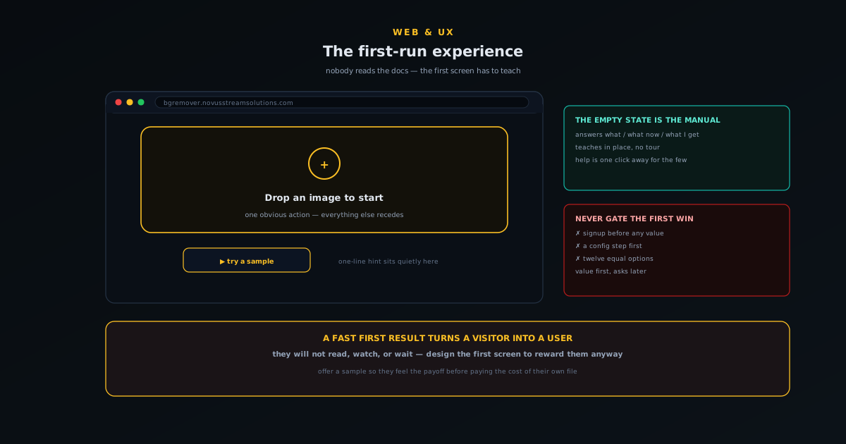
The first-run experience: onboarding a tool nobody reads docs for
How to onboard a tool that no one reads docs for: why the first screen is the only instruction most users will ever see, designing the empty state to teach rather than just sit there, making the single most important action unmissable, getting to a first result fast, and layering help so it is there without being in the way.
NSS Background Remover
Web & UX · Jun 15, 2026
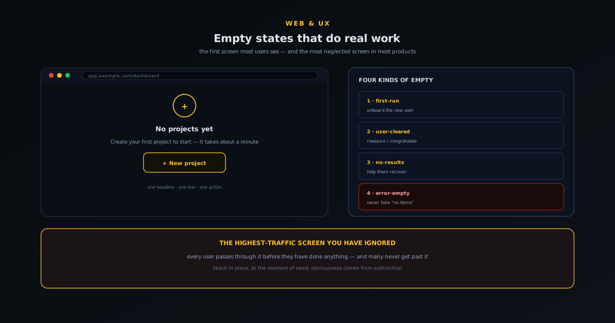
Empty states that do real work: designing the screen users hit first
Why the empty state is the highest-traffic screen you have ignored, the four kinds of empty (first-run, user-cleared, no-results, error-empty) and what each one owes the user, the anatomy of an empty state that does work, and the small copy and design choices that turn a blank screen into momentum.
Novus Stream Solutions (hub)
Web & UX · Jun 10, 2026
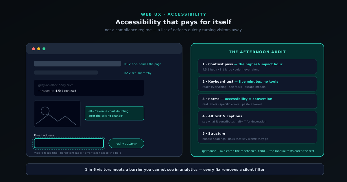
Accessibility that pays for itself: a practical pass for small sites
A working accessibility pass for small-site owners: the overlap between accessible and good, contrast and color, keyboard and focus, forms that explain their errors, alt text and media, heading structure, and how to test all of it in an afternoon with free tools.
Novus Stream Solutions
Web & UX · Jun 10, 2026
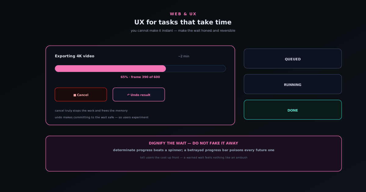
UX for tasks that take time: progress, cancel, and undo
How to design for operations that genuinely take time: the difference between perceived and real performance, why determinate progress beats an endless spinner, building a cancel that actually stops the work, giving slow results an undo so commitment never feels risky, and being honest when something will take a while.
Novus Visualizers