2026 · Novus Stream Solutions (hub)About 12 min readNovus Stream Solutions
Forms that don't frustrate: field-tested rules
Nobody wakes up wanting to fill in a form; they want the thing on the other side of it. Every rule here comes from watching real people stall on real fields: where labels belong, when validation should speak, how errors should sound, which input attributes fix mobile typing, and the question to ask before building a form at all.
Contents
Overview
The most instructive twenty minutes of interface education I ever got was watching someone try to give us money and fail. A checkout form (not ours, mercifully) rejected her phone number three times for a formatting rule it never stated, cleared the card field when she went back to fix it, and lit up six fields in red the moment the page loaded. She did not complain. She closed the tab. The company will record that as an abandoned cart, and the form will keep doing it to someone every hour until a designer happens to watch.
Forms deserve more craft than they get because they are where intent goes to die. A visitor who reaches a form has already decided to act (to sign up, buy, subscribe, ask) and every point of friction from there on is spending goodwill that was already won. The rules in this piece are not aesthetic preferences; each one exists because its violation measurably stalls real people: label placement, validation timing, error wording, mobile input behavior, field count, and, before any of those, whether the form should exist.
A scope note: this article ends at the submit button. What happens after (progress indication, failure recovery, the anxiety of a spinner on a slow network) is its own discipline, and it is covered separately in UX for tasks that take time: progress, cancel, and undo. Here the job is narrower and comes first: get an honest person through a set of fields without making them feel stupid, tricked, or tested.
Ask first whether the form should exist
The highest-leverage form improvement is deletion, and it is on the table more often than people admit. Every field is a small interrogation, and every form is a claim that the interrogation is necessary, a claim worth auditing. Our own strongest product decision was exactly this audit: the background remover has no signup form because it does not need one to remove a background. The reasoning, and what it cost and earned, is laid out in Account-based vs no-account creative tools: which one keeps your work safe?; the short version is that deleting the form outperformed every conceivable optimization of it.
The same audit applies field by field on the forms that survive. Phone number: will anyone actually call it? Company name: does anything downstream consume it? Address line two, honorific, fax: forms accrete fields because adding one is a one-line change and removing one requires a meeting. The test I hold is concrete: if a field’s value does not change what happens next, it is not a field, it is a survey question wearing a required asterisk, and surveys belong somewhere that is not between a person and their goal.
Sometimes the form should exist but not yet. Progressive capture (ask for the minimum now, request the rest at the moment it becomes relevant) beats the everything-upfront form in almost every flow that has a second step. A person who has received value will hand over details that the same person, pre-value, would have abandoned over. The order of asking is a design material in itself, and the default order (everything, immediately, gated) is the worst one available.
Put the label where the eye expects it
Labels go above their fields, left-aligned, always visible. It is not a style choice; it is how form-filling eyes move: a straight vertical scan down one axis, label then field then label then field, with no horizontal hunting. Left-of-field labels create a ragged gutter that forces zigzag reading and break down entirely on narrow screens; labels inside the field are the famous disaster, because the moment you focus or type, the label is gone and the field is a mystery box. Above-the-field is boring precisely because it never fails.
Placeholder-as-label deserves its own paragraph of hostility, because it keeps being shipped by people who know better. The placeholder vanishes on input, so reviewing a filled form means memory-testing what each value answers; its default gray routinely fails contrast; browsers autofilling make the mystery total; and screen readers treat placeholders inconsistently at best. Placeholders have exactly one legitimate job (a format example, like a sample date) and even that is often better said in persistent helper text below the field.
The floating-label compromise (a placeholder that shrinks into a label on focus) solves the amnesia but keeps other costs: the animation draws attention to typography instead of the task, the shrunken label often lands under 4.5:1, and the pattern needs careful engineering to survive autofill. I have shipped it under aesthetic pressure and regretted the maintenance every time. A static label above the field costs nothing, reads instantly, and works in every browser condition that exists.
While placing labels, connect them. The label element pointed at the input via for and id is what makes the label clickable (a larger tap target for free) and what lets assistive tech announce the field correctly. Helper text and error text get wired in with aria-describedby so the full context travels with focus. This is four attributes of markup, and it is the difference between a form that works with a screen reader and one that is a row of unlabeled boxes; the broader payoff of such defaults is the subject of Accessibility that pays for itself: a practical pass for small sites.
Time validation to the person, not the keystroke
Validation timing is the single largest lever on how a form feels, and both extremes are hostile. Validate on every keystroke and you scold people mid-thought: the email field is red at "j" and stays red until the final character, a treatment that trains anxiety. Validate only on submit and you run an ambush: the person believes they are done, and the form reveals it was collecting grievances in silence. Both patterns say the same thing, that this form is not on your side, through opposite mechanisms.
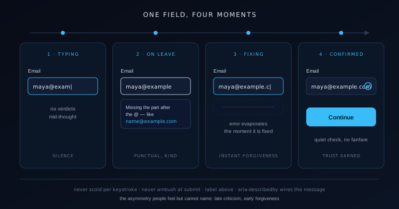
The pattern that respects how people actually work is validate late, re-validate early. A field stays quiet while it is being filled for the first time; when the person leaves it, it gets checked, and any error appears then, attached to the field, while the context is still warm. From that moment the rules flip: a field already marked wrong re-validates on every input, so the error evaporates the instant the fix lands rather than lingering until the next blur. Punctual criticism, instant forgiveness: that asymmetry is the entire trick, and people feel it without being able to name it.
Two refinements earn their complexity. First, do not blur-validate emptiness aggressively: tabbing through a form to survey it is legitimate behavior, and lighting up every skipped field as an error punishes reading. Required-but-empty is best raised at submit, politely, with focus moved to the first offender. Second, for fields with async checks (username availability, coupon codes) debounce and show the checking state honestly rather than resolving green-red-green as requests race. A form that flickers its verdicts teaches people to stop trusting its verdicts.
Submit-time validation still exists as the backstop, and its job is orchestration: catch whatever slipped through, summarize when multiple fields fail, and move focus to the first problem. On long forms, an error summary at the top, with links that jump to each field, turns a scavenger hunt into a checklist. And the summary must never be the only marker; every failing field carries its own error, because the person scrolling reads the page, not the summary.
Write errors the way you would say them
An error message is a conversation with a person mid-task, and most are written like log lines for a machine that will never read them. "Invalid input" answers none of the three questions an error owes: what went wrong, on which understanding, and what to do now. The craft is small and completely learnable: name the field’s expectation in the same words the label used, state what to change, and keep the register of a competent human helping rather than a system objecting. Wrong: "Validation error: email format." Right: "This email is missing the part after the @, like name@example.com."
Tone drifts hostile under three pressures worth naming. Blame framing ("you entered an invalid date") makes the person the subject of the failure; the field is the better subject. Jargon leaks ("must match pattern") export the developer’s regex into the user’s afternoon. And upper-case scolding with exclamation marks converts a correctable slip into an accusation. Every error we ship passes a one-line test: would I say this sentence, aloud, to someone I respect who is trying to give me money?
Some rewrites from our own forms and checkouts, before and after, to make the register concrete:
- "Invalid phone" became "Phone numbers here need 10 digits, and just the digits is fine."
- "Password does not meet requirements" became "Add one number and you are set: 8+ characters, one number."
- "Required field" became "We need a delivery email so we can send your files."
- "Card declined [05]" became "The card was declined by the bank; a different card usually works."
- "Date range error" became "The end date is before the start date; swap them and this will pass."
Summon the right mobile keyboard
On a phone, the keyboard is part of your form whether you designed it or not. A person tapping into a card-number field and receiving the full alphabet keyboard, then hunting for the numeric plane, per digit-group, sixteen times, is experiencing a bug you shipped, even though nothing errored. The fix is entirely declarative: type and inputmode attributes tell the OS which keyboard the field deserves, and autocomplete tells it what it can prefill. Three attributes, zero JavaScript, and the difference on mobile completion is not subtle.
The mapping is worth having memorized. Email fields get type email, which adds the @ key to the primary plane. Phone gets type tel and its dial pad. Numeric codes (one-time passwords, postal codes, card numbers) get inputmode numeric, which is usually righter than type number; number inputs bring spinner arrows, scroll-wheel value changes, and the silent rejection of leading zeros that mangles postal codes. URLs get type url. And search fields get type search, which relabels the return key to describe the action. The full matrix lives on MDN and repays ten minutes of reading.
Autocomplete is the most underused attribute in commerce. Well-tokened fields (name, email, street-address, cc-number and its siblings) let the browser fill an entire checkout from stored values in two taps, collapsing minutes of thumb-typing into a confirmation glance. Teams disable it citing data-quality folklore, then wonder at their mobile abandonment; browser-filled values are typically cleaner than thumbed ones. Turning autofill off is asking every returning customer to re-type their identity as a loyalty test.
Two mobile-specific courtesies finish the job. Never disable paste: password managers and emailed codes depend on it, and blocking it converts your most security-conscious users into your most frustrated. And treat auto-capitalization deliberately: names want it, email addresses and codes must not have it, and the autocapitalize attribute is where that intention lives. Each of these is a one-attribute decision that someone, somewhere, is currently failing a login over.
Cut fields until it hurts
Field count is the strongest simple predictor of form abandonment, and the causality is not mysterious: every field is a cost paid before the reward, and the running total is visible at a glance. The discipline is to make each field re-justify itself against the question from the top of this article (does this value change what happens next?) and to be honest about the answer under pressure. When we trimmed a six-field contact form to three, replies went up and their quality did not drop; the deleted fields had been answering our curiosity, not our workflow.
For the fields that survive, extract cost from each one. Do not split names into first and last unless something downstream genuinely needs the split; one name field respects more of the world’s names and halves the typing. Derive city and region from the postal code instead of asking for all three. Make optional truly optional and label it so, rather than marking required fields with an asterisk and leaving the rest ambiguous. And never ask for the same thing twice on one journey; a person who typed an email at step one should see it prefilled at step three, or they will correctly conclude that nobody is home.
Long forms that cannot shrink should chunk instead. Grouping related fields under small headings (contact, delivery, payment) restores the sense of progress that a wall of thirty inputs destroys, and multi-step flows with an honest progress indicator outperform single monoliths for anything past a dozen fields. The caveat is that steps must be cheap to move between, with earlier answers preserved and editable; a wizard that forgets step two while you are on step four is a monolith with extra betrayal.
Watch one stranger fill it in
Every rule above was learned, not deduced, mostly by watching people use forms while saying what they were thinking. The method costs nothing and outperforms any heuristic list, this one included: recruit one person unfamiliar with the form, ask them to complete it while narrating, and say nothing while they struggle. The silences are the data. Where the narration stops, where the cursor circles, where they reread a label twice: each hesitation marks a spot where the form asked them to think about the form instead of their goal.
The analytic complement is field-level funnel data: which field is focused last before abandonment, which errors fire most, how long each field holds focus. A checkout that loses people specifically at the phone field is telling you which paragraph of this article to reread. But numbers locate problems without explaining them, which is why the one-stranger session remains the highest-yield hour in form work: it converts "field 7 has a 40% error rate" into watching a reasonable person misread the label you wrote.
Forms are where a site stops talking at people and starts asking things of them, which is why their craft is disproportionately felt. Everything here compresses to one stance: the form is the interruption, the person’s goal is the point, and every label, error, keyboard, and deleted field either honors that or taxes it. The same stance one step earlier in the journey (the page that persuades before the form asks) is written up in Landing pages that convert without dark patterns, and the two pieces are ultimately about the same thing: winning trust by visibly not spending it.
Frequently asked questions
Quick answers to common questions about this topic.
When should form validation fire: on keystroke, on blur, or on submit?
Use the late-then-early pattern. Stay silent while a field is being filled for the first time; validate when the person leaves it, showing any error right at the field. Once a field has an error, flip to validating on every keystroke so the message disappears the instant the fix works. Keep submit as the backstop that catches empties, summarizes multiple failures, and moves focus to the first problem. Avoid both extremes: per-keystroke scolding of half-typed values, and the submit-time ambush that reveals six errors at once.
Where should form labels go?
Above the field, left-aligned, permanently visible, and programmatically connected with for and id. Top labels support the natural vertical scan, survive narrow screens, and never disappear. Avoid placeholder-as-label entirely: it vanishes on input so filled forms cannot be reviewed, its default contrast usually fails accessibility, and autofill turns fields into unlabeled mystery values. Placeholders are acceptable only as format examples, and even those are often better as persistent helper text below the field where they stay readable after typing begins.
How do I get the right keyboard on mobile forms?
Declare it in the markup. Use type="email" for email so the @ key is present, type="tel" for phone dial pads, and inputmode="numeric" for codes like OTPs, postal codes, and card numbers; that is usually better than type="number", which adds spinners and rejects leading zeros. Add honest autocomplete tokens (name, email, cc-number, street-address) so browsers can prefill, set autocapitalize appropriately, and never block paste. These are pure attributes, with no JavaScript, and they remove most of the thumb-typing that kills mobile completion rates.
What makes a good error message on a form?
It answers three things in the user’s own vocabulary: what is wrong, what the field expected, and what to do now. Make the field the subject rather than the person ("this email is missing the part after the @" beats "you entered an invalid email"), include a concrete example of a passing value, and keep the tone of a competent human helping. Place the message at the failing field, wire it to the input with aria-describedby so screen readers announce it, and clear it the moment the correction succeeds.
How many fields should a form have?
As few as the very next step genuinely requires; for most contact and signup flows that is two or three. Audit each field by asking whether its value changes what happens next; if not, it is curiosity taxing conversion, and it should be deleted or deferred until the moment it becomes relevant. Prefer one name field over first/last splits, derive what you can (city from postal code), label optional fields explicitly, and prefill anything already known. When a long form is unavoidable, chunk it into labeled groups or honest steps that preserve earlier answers.
Related troubleshooting
Was this page helpful?
Your answer stays in this browser, it is not sent anywhere and no account or cookie is involved.