2026 · Novus Stream Solutions (hub)About 13 min readNovus Stream Solutions
Accessible color systems for dark UIs
Dark interfaces fail quietly: text that looked fine at midnight is unreadable in an office, focus rings vanish, disabled states blur into enabled ones. After building several dark-first tools, this is my working system: the contrast numbers that matter, how to spend an accent color, state design, and the tests that catch what your eye forgives.
Contents
- 1.Overview
- 2.Dark is not light inverted
- 3.The numbers: what WCAG asks of a dark palette
- 4.Choosing the grays: surfaces, borders, and elevation
- 5.Accent discipline: one color, spent like money
- 6.States on dark: hover, focus, disabled
- 7.The traps: a short catalog of dark-mode failures
- 8.Testing: tools that catch what your eye forgives
- 9.Keeping the system honest as it grows
Overview
Every dark interface I have shipped looked great the night I built it. Dark themes flatter you at midnight on a good monitor with the lights off: low-contrast grays read as sophisticated, dim labels feel calm, thin dividers feel refined. Then someone opens the same screen at 2 p.m. next to a window, on a mid-range laptop panel at 40% brightness, and the sophisticated grays are simply gone. The gap between how dark UIs look in the design session and how they perform in daylight is the central problem this article is about.
Our tools are dark-first by design (an editor you stare at for an hour should not be a white rectangle) so I have had to get systematic about this rather than treating each screen as a fresh aesthetic negotiation. What follows is the system: the actual WCAG numbers and what they mean on dark backgrounds specifically, how to structure grays for panels and elevation, why the accent color needs a budget, how hover, focus, and disabled states change on dark, and the small set of tools that catch failures my adapted eyes cannot.
One framing note up front: accessibility on dark is not a constraint fighting the aesthetic. Every fix in this article (brighter text tokens, visible focus, states that read at a glance) made our interfaces look better to everyone, not just users with low vision. Contrast failures are not a look; they are a rendering of the designer’s monitor privilege, and removing them is design work, not compliance work. The wider argument for that position lives in Accessibility that pays for itself: a practical pass for small sites.
Dark is not light inverted
The first instinct, to take the light palette and flip it, produces a bad dark theme every time, because several perceptual effects change direction when the ground goes dark. Pure white text on a very dark ground has plenty of measured contrast but produces halation: the letterforms bloom, especially for astigmatic readers, of whom there are many. Thin font weights that were fine as dark-on-light get visually eroded as light-on-dark. And saturated colors that sat politely on white become fluorescent on near-black, buzzing against their background instead of sitting in it.
The physics of screens adds its own asymmetry. On light themes, the background does most of the work of defining shapes; on dark themes, the content does, which means text and borders carry more structural load exactly when the rendering conditions are worst: dark pixels are where cheap panels are least uniform, where reflections eat detail, and where aggressive brightness reduction lands hardest. A dark theme has to be designed with more contrast margin than a light one, not the same margin relocated.
So the working posture is to design dark as its own system with its own tokens, related to the light theme by role rather than by arithmetic. The text-primary token on dark is not white because the light one was black; it is a slightly softened near-white chosen to clear contrast targets without halation. The surface tokens are not inverted paper; they are a deliberate ramp of dark grays. Inversion is a starting sketch at best; every value gets renegotiated against the dark ground.
The numbers: what WCAG asks of a dark palette
The rules are the same in both themes (WCAG contrast ratios are symmetric, computed from relative luminance regardless of which color is the text) but the places palettes fail are different. The thresholds worth memorizing are 4.5:1 for normal body text, 3:1 for large text at roughly 24 pixels or 19 bold, and 3:1 for non-text essentials like input borders, icons that carry meaning, and focus indicators. Those come straight from the success criteria, and the understanding documents linked in the sidebar are worth an occasional slow read.
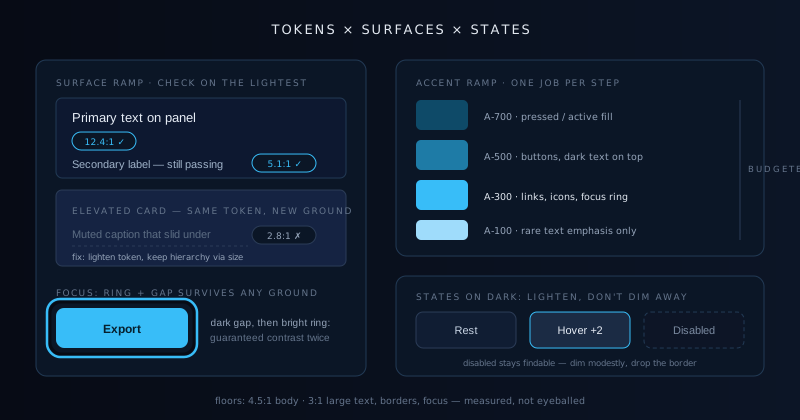
On dark palettes, the characteristic failure is not the body text, which most people get right; it is the secondary layer. Muted labels, placeholder text, timestamps, captions, helper text: the tokens designers instinctively dim for hierarchy are precisely the ones that slide under 4.5:1 against a dark panel. A gray that reads as tastefully subdued on your OLED at night can measure 2.8:1, which is not subdued; it is failing. My rule after too many of these: hierarchy on dark comes from size, weight, and spacing first, and from dimming only within the range that still passes.
The other habitual failure is measuring against the wrong background. A dark UI is not one background; it is a stack (page under panel under card under input) and text sits on all of them. A muted token tuned to pass on the deepest layer can fail on an elevated card two steps lighter. The system answer is to define the surface ramp first, then verify every text token against the lightest surface it will ever appear on, not the darkest. These are the floors I hold, and they are floors, not targets:
- 4.5:1 minimum for body and secondary text against the lightest surface it sits on.
- 3:1 minimum for large headings, meaningful icons, and input borders.
- 3:1 minimum for focus indicators against their adjacent colors.
- Aim body text near 7:1 on dark: the margin absorbs bad panels and bright rooms.
- Never encode meaning in color alone; pair it with a label, icon, or weight change.
Choosing the grays: surfaces, borders, and elevation
The gray ramp is the skeleton of a dark theme, and the two ends of it deserve deliberate choices. The base is not pure black: #000 maximizes halation, makes every other dark gray look muddy by comparison, and turns OLED smearing visible during scroll. Something in the very dark blue-gray range (our sites sit around the #0a0f1a neighborhood) reads as black while behaving better. From there, elevation is communicated by lightening surfaces as they rise, since shadows, the light theme’s elevation cue, have almost nothing to cast against on a dark ground.
Borders do more work on dark than designers expect. On light themes, surface-versus-surface difference is often enough to separate a card from the page; on dark, adjacent dark grays melt together on any panel that is not perfectly calibrated, and a one-pixel border in a slate tone is what keeps the structure legible. The border tokens want the same treatment as text tokens: defined once, checked against the surfaces they separate, held near the 3:1 line when the border is the only thing distinguishing an input from the panel behind it.
A tint unifies the ramp. Neutral grays on dark tend to look dead, so we pull every surface and border a few degrees toward the brand’s blue: enough that the theme feels intentional, little enough that photographs and content colors are not distorted by the environment around them. The same layered thinking applies at every screen size, and it has to survive the compressed spacing of small screens; the layout side of that discipline is written up in Mobile-first layout for content and tools.
Accent discipline: one color, spent like money
A dark ground amplifies color. The same accent that whispered on white shouts on near-black, which is a gift and a hazard: a single accent can organize an entire dark interface, and two competing accents can reduce it to a casino. The discipline that works for us is a budget: one accent color, spent only on things the user can act on or must notice: primary actions, active states, links, the progress of something they are waiting for. Decoration never gets the accent. If everything glows, nothing does.
Accent-on-dark has a specific accessibility trap: the comfortable range is narrow. Darken an accent for a pressed state and its text-on-accent contrast collapses; brighten it for emphasis and it begins to bloom against the ground. The escape is to stop asking one swatch to do every job: define an accent ramp of three or four steps, verify each step against both the dark surfaces and whatever text sits on top of it, and assign steps to roles. Our buttons use a mid step with near-black text, precisely because white text on a bright accent usually fails 4.5:1 while dark text passes with room to spare.
The reward for the discipline is that attention becomes steerable. When the accent is scarce, lighting a single control with it is enough to pull the eye across a dense screen, which is the entire mechanism behind the guided help mode described in Designing a help mode that pulses the control you need, which works only because nothing else on the screen is competing in the same hue. An accent color is an attention budget wearing a hex code, and overspending it is how dark UIs become both inaccessible and exhausting.
States on dark: hover, focus, disabled
Interactive states are where dark themes get quietly worse than their light siblings, because the standard tricks stop working. Hover on light is usually a slight darkening; on dark surfaces there is nowhere darker to go, so hover becomes a slight lightening, and it needs to be a bigger step than feels tasteful at midnight, because a 3% lift that reads on an OLED disappears entirely on an office panel. I hold hover surfaces roughly two ramp steps above their resting state and accept that it looks assertive on a good screen; assertive is recoverable, invisible is not.
Focus is the state with a legal-grade requirement and the one dark themes most often destroy. A one-pixel outline in the accent color over a dark ground can fall below 3:1 against either the control or the page, and keyboard users lose their position on the screen. The robust pattern is a two-part indicator: a bright ring with a dark gap between it and the control (box-shadow makes this trivial) so the ring is guaranteed contrast against something no matter what it sits on. We test focus visibility by tabbing across every screen with the mouse untouched; it takes minutes and fails loudly when it fails.
Disabled states present a genuine dilemma on dark: convention says dim them, but dimming on dark is exactly how things vanish. WCAG exempts disabled controls from contrast minimums, and treating that exemption as permission is how users end up staring at a form that appears to have no submit button. Our compromise is to dim modestly, keep the label legible, and rely on additional cues (the removed border, the flat surface, the cursor) to carry the meaning. A disabled control the user cannot find is not communicating anything; it is just missing.
The unifying test for every state: can you tell what is interactive, what is focused, and what is unavailable from six feet away, on the worst screen in the house, in the afternoon? States are communication, and on dark backgrounds the signal has to be sent with more power than the same message needed on white.
The traps: a short catalog of dark-mode failures
Pure black backgrounds are the first trap, covered above, but its sibling is pure white text: #fff on #000 is maximum measured contrast and maximum halation, the rare case where the number is technically great and the reading experience is worse for it. Softening text to the #e8-ish range keeps ratios comfortably above 7:1 while letting letterforms hold their shape. The second trap is shadows-as-elevation: box shadows are nearly invisible on dark grounds, and interfaces that lean on them flatten into ambiguity. Lightened surfaces and hairline borders take over that job.
The third trap is saturated text. Colored text that worked on white (a red error, a green success line) often fails contrast on dark in its familiar shade, and the fix of maximizing saturation produces vibrating, bloomy text. The pattern that survives is desaturated-and-lightened semantic tones for text and icons, with the saturated version reserved for fills and badges where no one has to read letterforms rendered in it. The fourth trap is images and embeds: pure-white content in an iframe or an unstyled logo on transparent background will flashbang your carefully tuned theme, so media gets a subtle background token and, where appropriate, a slight dimming layer.
The last trap is trusting adaptation. After twenty minutes in your own dark UI, your eyes have adapted to it and everything looks fine, the low-contrast label included. Every trap in this catalog was shipped by someone who looked directly at it and saw no problem, which is the strongest argument I know for the next section: measurement, not vibes.
Testing: tools that catch what your eye forgives
The foundational habit is checking ratios at design time, not audit time. Any contrast checker does the arithmetic (WebAIM’s is the classic) but the leverage move is wiring the check into the palette itself: our color tokens live in one file, and a small script computes every text-token-on-surface-token pair and fails when one dips below its floor. Contrast regressions stopped shipping the week that script joined the build, for the same reason typos stopped shipping when the content gate did: the check runs every time, and I do not have to remember to care.
Browser tooling covers the in-context cases the token matrix cannot see. DevTools shows the computed ratio with pass/fail badges directly in the color picker, and its rendering emulation simulates the common color-vision deficiencies, worth a pass on anything where color carries state, like our diff between active and inactive layers. The step people skip is environmental: turn brightness down to a third, view the screen in a bright room, step back two meters. Ten seconds of that reveals what an afternoon laptop user will experience, and it routinely contradicts the pixel-perfect midnight impression.
The deepest test costs nothing but humility: navigate the interface by keyboard only, then with a screen reader narrating, and watch where you get lost. Contrast is one slice of accessibility, and a dark theme with perfect ratios can still strand a keyboard user with an invisible focus ring or announce a color-only state as silence. Automated checkers catch perhaps half of real accessibility problems; the other half are found by using the interface the way someone unlike you uses it.
Keeping the system honest as it grows
A color system decays through exceptions. The first hard-coded hex (a one-off gray because the token was almost right) is harmless; the fortieth means you no longer have a system, you have a mood board with opinions. The defense is structural: tokens are the only way color enters a component, new tokens require a stated role and a verified pair of contrast checks, and the periodic grep for raw hex values in component code is treated as seriously as a failing test. Boring governance, but it is the difference between a palette and a pile.
Growth also means new surfaces the original ramp never anticipated: an overlay, a code block, a chart. The temptation is to freestyle each one; the durable move is to extend the ramp deliberately, run the new surface against every text token that will touch it, and write the pairing down. Charts deserve special mention because data colors have their own contrast requirements against dark grounds and against each other, and a palette that distinguishes six series on white can collapse to three distinguishable hues on near-black.
The payoff for all of this discipline is speed, which surprises people. With a verified token system, dark-theme design decisions become table lookups (this text on that surface, this step of the accent for that state) and whole new screens compose in minutes with accessibility inherited rather than re-litigated. The system absorbs the care once, then dispenses it for free. That is the quiet economics of doing color properly: expensive for a week, cheap forever after.
Frequently asked questions
Quick answers to common questions about this topic.
What contrast ratio does dark-mode text need to pass WCAG?
The same as light mode; the standard is symmetric. Body text needs at least 4.5:1 against its background; large text at roughly 24 pixels, or 19 pixels bold, needs 3:1; and non-text essentials like meaningful icons, input borders, and focus indicators need 3:1. The dark-specific advice is to treat those as floors and aim body text near 7:1, because dark pixels suffer most from cheap panels, reflections, and low brightness. Always measure against the lightest surface the text ever sits on, not the page background.
Should a dark theme use pure black backgrounds?
Generally no. Pure black maximizes halation (light text blooming at the edges, hardest on astigmatic readers), makes elevation difficult because there is nothing darker for the ramp to start from, and shows OLED scroll smearing. A very dark gray with a slight brand-hue tint, somewhere in the #0a1015 to #12141a neighborhood, reads as black while leaving room for lighter surfaces to communicate elevation. Pair it with slightly softened near-white text rather than pure #fff, and the whole theme becomes calmer and more legible at once.
Why does my dark UI look fine to me but unreadable to others?
Three compounding reasons. Your eyes adapt: after minutes in your own interface, low-contrast elements look intentional rather than faint. Your hardware flatters: designers tend to use bright, well-calibrated, often OLED screens, and dark grays that separate cleanly there merge on a mid-range laptop panel. And your environment differs: dark themes tuned at night in dim rooms lose their margins in daylight. The fix is measurement over impression: check token ratios programmatically, and view your screens at low brightness in a bright room before shipping.
How do I make focus states visible on a dark background?
Use a two-part indicator: a bright focus ring separated from the control by a dark gap, easily built with layered box-shadows. The gap guarantees the ring contrasts against something (either the control or the page) no matter what colors surround it, which a single one-pixel outline cannot promise. Keep the ring at 3:1 or better against adjacent colors, make it at least two pixels thick, and test by tabbing through every screen without touching the mouse. If you ever lose your place, the ring is not done.
What tools catch dark-mode contrast problems?
For single pairs, any contrast checker, including the one built into browser DevTools color pickers, which shows pass/fail thresholds inline. For system-level safety, script the check: keep colors as tokens in one file and compute every text-on-surface ratio automatically, failing the build on regressions. Add DevTools vision-deficiency emulation for anything that encodes state in color, and finish with the analog tests automation misses: low brightness in a bright room, keyboard-only navigation, and a screen reader pass. The scripted matrix catches drift; the analog passes catch reality.
Related troubleshooting
Was this page helpful?
Your answer stays in this browser, it is not sent anywhere and no account or cookie is involved.