2026 · Novus VisualizersAbout 13 min readNovus Stream Solutions
Matching visualizer styles to music genres: a working guide
A dubstep drop and a fingerpicked ballad should not share a visualizer, yet default settings treat them identically. Genres carry visual languages their audiences already speak (strobe logic for EDM, drift for lo-fi, aggression for metal, restraint for acoustic), and learning to read a track’s energy profile tells you which one to use.
Contents
- 1.Overview
- 2.Reading the energy profile before choosing anything
- 3.EDM and dance: strobe logic and beat rings
- 4.Lo-fi and chillhop: motion that drifts instead of reacts
- 5.Metal and heavy music: the spectrum as a weapon
- 6.Acoustic and vocal-first tracks: the minimal case
- 7.A layer budget for every genre
- 8.Platform norms outrank genre instincts
- 9.Turning the call into a template
Overview
Put the same audio-reactive template behind a dubstep track and a fingerpicked folk song and both audiences will feel that something is off, even if neither can articulate what. The dubstep listener reads the gentle pulsing as limp; the folk listener reads any pulsing at all as noise. Genre is not just a sound; it is a set of visual expectations trained into audiences by two decades of music videos, album art, club lighting, and channel branding, and a visualizer either speaks that language or marks itself as generic.
I learned this by publishing the mismatches. Early on I rendered everything through the styles I personally liked (mostly slow, atmospheric ones) and watched an energetic house track underperform with visuals that would have suited a sleep playlist. Nobody commented on the visuals. The retention graph commented. When I re-rendered the same track with visuals cut to its actual energy, average view duration climbed by a third, and I started treating genre-to-style matching as a craft decision rather than a taste decision.
The method that came out of it has two parts. First, read the track itself (tempo, transients, dynamics, and where the spectrum carries its weight) because "genre" is really shorthand for a bundle of those measurable properties. Second, apply the genre’s visual conventions deliberately: as a starting grammar you can follow, bend, or break, but never ignore. This guide works through the reading step, then four genre case studies from opposite corners of the map, then the layering and platform decisions that finish the job.
Reading the energy profile before choosing anything
Four properties tell you most of what a track needs visually. Tempo sets the base rate of motion: not just fast versus slow, but whether motion should ride every beat or every other bar. Transient density measures how much percussive punctuation the track carries: a trap beat is a field of sharp attacks, a pad-driven ambient piece has almost none, and reactive visuals feed on transients the way rings feed on kicks. Dynamic range is the distance between the quietest and loudest passages: wide range means the visuals need somewhere to grow, narrow range means constant intensity is honest. Spectral balance says where the energy lives: bass-heavy tracks reward low-band reactivity, vocal-forward tracks reward mids.
I do the reading with my ears and a preview render, not a spreadsheet. Play the track once and ask: what is the loudest moment, what is the quietest, how often does something hit, and what would I point at if asked where the song lives: the kick, the voice, the guitar? Then load it into the editor and watch a bare spectrum for thirty seconds; the shape of the bars confirms or corrects the ear’s verdict. The section-selection guidance at Picking the perfect song (section) for your visualizer pairs well with this step, because the passage you visualize should be the one whose energy profile represents the release.
The reason to measure before styling is that genre labels drift and tracks defy them. A "metal" track that is actually a clean-sung power ballad wants ballad visuals. A "lo-fi" track with an unusually punchy drum loop can carry more reaction than the genre default suggests. The label gets you to the right neighborhood; the energy profile picks the house. When the two disagree, trust the profile: the audience responds to what they hear, not to the tag on the upload.
Profile-reading also settles arguments with yourself later. Halfway through styling, every choice starts to feel negotiable (maybe more particles, maybe a faster camera), and without a reference point the session drifts toward whatever looked good in the last preview. Writing down four values before opening the editor (tempo, hits-per-bar rough count, quiet-to-loud span, where the energy lives) gives every later decision something to answer to. When a candidate effect contradicts the profile, the profile wins, and the render stays coherent instead of becoming a diary of the evening’s moods.
EDM and dance: strobe logic and beat rings
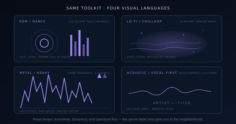
Dance music is built on the grid, so its visuals are too. The workhorse element is the beat ring (a circle that spawns on the kick and expands outward as it fades) because it makes the pulse visible without occupying the frame between hits. Rings, kick-scaled logos, and camera punches all follow the same rule I think of as strobe logic: sharp attack, fast decay, then get out of the way. The eye should experience the beat the way the body does in a room with the track playing, as an impact, not a smear. Slow easing curves are the tell of a mismatched EDM visual; nothing in the genre eases gently into anything.
Restraint is what separates a professional EDM visual from a seizure of effects. The track’s own arrangement tells you when to escalate: verses get the rings and a breathing background, builds add risers (brightening, accelerating particles, a camera creep), and the actual strobe moments are reserved for drops, where they land with force precisely because they were hoarded. Mapping different bands to different elements keeps the frame organized under all that motion; the multi-band approach in Mastering beat-sync: Beat Burst and beat-reactive properties (kick to one element, hats to another, bass to a third) is close to mandatory here, because a single-trigger visual turns to mush at 128 BPM.
Palette-wise, dance music tolerates and rewards saturation that would look garish anywhere else: electric cyans, magentas, acid greens, usually two hues locked in high contrast against deep black. Black matters more than the accent colors: it is what makes the strobe moments read as light rather than as color fill, and it keeps sustained brightness from fatiguing viewers across a forty-minute mix. If the render feels like a rave poster from across the room, the palette is correct.
Lo-fi and chillhop: motion that drifts instead of reacts
Lo-fi inverts the EDM contract: the visuals are wallpaper in the best sense, designed to be felt in peripheral vision during two hours of studying rather than watched. Drift is the core verb: a slow zoom that takes a minute to travel, haze that migrates across the frame, dust motes falling at different parallax speeds, a light source that breathes over eight bars. Motion decouples from the beat almost entirely. Where an EDM ring answers every kick, a lo-fi scene acknowledges the beat with, at most, a gentle sway in a waveform line or a barely perceptible pulse in the glow.
The genre’s palette and texture rules are as established as its sound: warm and muted (ambers, dusty roses, desaturated teals) with film grain, soft vignette, and a general sense that the image was found rather than rendered. High contrast and saturated primaries break the spell immediately. So does perfection; the genre is named for fidelity loss, and a little visual imperfection (grain, chromatic softness, a flickering lamp) is idiomatic in a way that clean vector graphics are not.
The discipline of lo-fi visuals is resisting the urge to demonstrate effort. Every added reactive element makes the scene more impressive and less fit for purpose, because the audience chose this music to lower stimulation, not raise it. My test is to leave the render playing in a corner of the screen while I do actual work: if it ever pulls my eyes away, something is moving too fast or reacting too hard. It is the only genre where the goal is to be ignorable, which turns out to be its own exacting craft.
Metal and heavy music: the spectrum as a weapon
Metal is a wall of transients (double-kick patterns, palm-muted chugs, cymbals everywhere), and the honest visual for it is one that renders that density as aggression rather than smoothing it away. The jagged spectrum is the genre’s native element: tall, spiky frequency bars with instant attack and fast decay, drawn with hard edges and no rounding. Where other genres interpolate the spectrum into gentle curves, metal wants the rawness kept, the visual equivalent of leaving the distortion on. Sharp geometry follows: triangles, shards, and hard diagonals over circles and blobs, motion that snaps between states instead of gliding.
The palette is nearly monochrome by convention: blacks and grays or bone whites, with a single hot accent (blood red, toxic green, arc-flash white) used the way the music uses a scream, in bursts. Restraint operates differently here than in lo-fi: the frame can be violent, but it should be violently organized. A spectrum that spikes to the kick, a shard layer that fractures on the snare, and a slow smolder in the background reads as heavy; ten unrelated effects firing at once just reads as broken. Even aggression needs a hierarchy.
Half-time sections and breakdowns are metal’s equivalent of the EDM drop, and the visuals should honor the drama: motion drops to half rate, elements grow heavier and slower, the accent color spreads; then the blast-beat return snaps everything back to full violence. Riding those arrangement shifts is what makes a metal visual feel authored by someone who listened, and it is the genre where I most often keyframe the intensity manually rather than trusting reactivity alone, because the music’s dynamics are structural, not statistical.
Acoustic and vocal-first tracks: the minimal case
Acoustic, folk, and singer-songwriter material carries the widest dynamic range and the fewest transients of anything I render, and the genre’s visual language is negative space. A single thin waveform line, breathing slightly with the performance. Sparse particles, if any. Typography (the artist and title, set quietly) doing more work than in any other genre, because the frame has room for it. The audience came for intimacy, and a busy frame is a broken promise; the visual’s job is to hold attention gently on the voice, not to compete with it.
Reactivity in this genre should track the mids, not the lows. There is often no kick to speak of, and tying motion to low-band energy leaves the visual inert through exactly the passages that matter. I bind the waveform or glow to the vocal band, so the image swells when the singer leans in, which is the genre’s actual rhythm. Warm, natural palettes fit the convention: creams, ochres, deep browns, forest tones; textures over gradients; light that behaves like late-afternoon sun rather than like a fixture.
The dynamic range deserves special respect. A quiet verse into a full-band final chorus can be a twentyfold energy shift, and the visual should travel that distance (nearly still at the start, visibly alive at the peak) without ever adopting dance-floor moves. Scale the amplitude of existing elements rather than adding new ones: the line swells taller, the glow warms, the grain quickens. Growth without clutter is the whole trick, and when it lands, the visual feels like it is listening along.
A layer budget for every genre
The genre cases above differ most concretely in how many moving parts the frame can hold, so I keep the decision explicit with a layer budget: a hard count of visual elements, agreed with myself before styling starts. Budgets prevent the universal failure mode of visualizer work: one more layer always looks like progress in the editor and reads as clutter on the couch. The editor view rewards addition; the viewing context rewards restraint. A written number keeps the negotiation honest.
The budget also assigns roles, which matters as much as the count. Every layer is either reactive (answers the audio), ambient (moves on its own slow schedule), or static (branding, typography, frame). The ratio between those roles is practically a genre fingerprint (EDM runs reactive-heavy, lo-fi runs ambient-heavy, acoustic runs static-heavy), and checking the ratio catches mismatches faster than staring at the render. A lo-fi scene with four reactive layers is wrong on paper before it is wrong on screen.
My working budgets, tuned across a few hundred renders, are below. Treat them as defaults to deviate from knowingly, not as rules, but when a render feels off and you cannot say why, count the layers first.
- EDM and dance: 4–6 layers, majority reactive (rings, spectrum, particles, camera motion, plus branding).
- Lo-fi and chillhop: 3–4 layers, majority ambient (scene, haze, dust, and at most one gently reactive element).
- Metal and heavy: 2–3 layers, all sharp (jagged spectrum, one fracture element, a smoldering background).
- Acoustic and vocal-first: 1–2 layers (a mid-band waveform or glow, and quiet typography on generous space).
- Any genre: every layer declared reactive, ambient, or static before styling begins.
Platform norms outrank genre instincts
A style matched perfectly to the genre can still be wrong for the surface it plays on. Long-form YouTube tolerates, even rewards, slow-developing 16:9 visuals, because viewers settle in; the lo-fi drift and the acoustic minimal case are built for that patience. Vertical short-form is the opposite regime: the first second decides the swipe, the frame is a phone held at arm’s length, and subtle motion simply does not register. The vertical-format specifics are covered in Making a vertical music visualizer for TikTok & Reels, but the genre-relevant rule is blunt: whatever your genre’s language, short-form demands its loudest dialect. Bigger elements, faster onset, higher contrast.
This is where genre conventions legitimately bend. An acoustic clip destined for Reels needs more visible motion in its first second than the genre would ever permit on YouTube: a type animation, a bloom of light, something that declares life immediately without betraying the palette. A lo-fi Short can run its drift at triple speed and still read as calm by short-form standards. I think of it as translating the genre statement into the platform’s volume, not replacing it: the vocabulary stays, the projection changes.
Platform also drives the engine decision. A drifting lo-fi scene lives comfortably in a 2D engine; EDM depth-punches and metal shard fields justify 3D; and the trade-offs between them (render cost, editing complexity, what each engine makes easy) are mapped in Choosing a visualizer engine: the ten engines and their modes. My habit is to choose genre language first, platform dialect second, engine last, because the engine is a means and the other two are the message. Choosing in the reverse order is how you end up with impressive renders that fit nothing.
Turning the call into a template
The genre reading only pays compound interest once it is saved. After the first render in a genre lands (palette proven, layer budget respected, reactivity bound to the right bands), I save the whole configuration as a named template: edm-rings-v2, lofi-drift-warm, metal-shards-red. The next track in that genre starts from a proven visual language instead of a blank canvas, and the styling session shrinks from an evening to twenty minutes of swapping art, title, and the audio file.
Templates also make an artist’s catalog coherent. A listener who arrives at a channel and sees ten releases in ten unrelated styles reads inconsistency, even for good individual videos; the same ten releases sharing a visual family read as an identity. Per-genre templates with deliberate per-release variation (same bones, different accent hue, different background art) deliver both recognition and freshness, which is exactly what channel branding asks of visuals.
The genre map is not four points; it is a space, and most tracks live between the corners. A synthwave track borrows EDM’s grid and lo-fi’s haze. A post-rock build wants acoustic restraint that ends in metal scale. When a track sits between genres, read its energy profile and blend the adjacent languages knowingly: a drifting scene that learns to hit on the half-time drop, a minimal line that grows teeth for the final chorus. The conventions are a grammar, and once you can speak it plainly, the interesting work is in the sentences the grammar never anticipated.
Frequently asked questions
Quick answers to common questions about this topic.
What visualizer style works best for EDM?
Beat-locked elements with sharp attack and fast decay: rings that spawn on the kick and expand as they fade, kick-scaled logos, camera punches, and a spectrum tied to the bass band. Use strobe-style flashes only at drops so they keep their force, escalate through builds with brightening and accelerating motion, and split frequency bands across different elements so the frame stays organized at 128 BPM. Saturated two-color palettes on deep black are idiomatic. The failure mode is smooth easing: dance music hits, and visuals that glide instead of snapping read as mismatched immediately.
What kind of visuals suit a lo-fi music channel?
Drift, not reaction. Slow zooms measured in minutes, migrating haze, falling dust at different parallax speeds, film grain, and warm muted palettes: ambers, dusty roses, desaturated teals. Motion should decouple from the beat almost entirely, with at most one gently reactive element like a swaying waveform. The audience uses lo-fi to lower stimulation while studying or working, so the visual’s job is to be pleasant in peripheral vision and ignorable on demand. A good test: if the render pulls your eyes away from real work playing in a corner of the screen, something is moving too fast.
Should the visualizer react to every beat of the track?
Only in genres where the beat is the point, and even there, not with everything at once. EDM and hip-hop reward dense beat-locking, but assign different elements to different bands (kick, hats, bass), so the frame reads as organized rather than convulsing. Lo-fi and ambient want almost no beat reaction at all, and acoustic material should track the vocal mids rather than a kick that barely exists. The reliable guide is the track’s transient density: lots of percussive hits can feed lots of reaction; sparse, sustained material asks the visual to breathe instead of flinch.
Should I use the same visualizer style across a whole album?
Use the same visual family, with deliberate per-track variation. A shared template (same layout, layer structure, and typography, varied in accent color, background art, or one element per track) makes the album read as a body of work and the channel read as an identity, while keeping each video distinct enough to feel intentional. Identical renders across ten tracks look lazy; ten unrelated styles look incoherent. Build the family template after the first track’s style lands, then vary one or two parameters per release. Recognition plus freshness is the target.
Do different music genres need different color palettes?
Yes. Palette is one of the strongest genre signals a visual sends, often faster than motion. Dance music carries saturated electric hues on deep black; lo-fi lives in warm, muted, slightly faded tones; metal runs near-monochrome with a single violent accent used in bursts; acoustic material suits naturals (creams, ochres, forest tones) lit like late afternoon. These conventions come from decades of album art and stage lighting, so audiences read them instantly. You can break them deliberately for contrast, but breaking them accidentally just reads as a mismatch between what viewers hear and what they see.
Related workflow
A track to a release-ready visualizer, per platform
Render the visual once, then produce the platform masters from it, instead of re-rendering the whole video for every aspect ratio.
- Render the beat-synced videoNovus Visualizers: Pick the engine and mode against your actual track; the analysis is done on your audio, not on a preset preview.
- Trim or upscale the exportNSS Background Remover: The video utilities handle the tidy-up pass so the render does not have to be repeated to fix ten seconds of it.
- Produce the per-platform mastersNovus Convert: Each destination wants a different container and bitrate; converting the finished render is far cheaper than re-rendering it.
Related troubleshooting
Was this page helpful?
Your answer stays in this browser, it is not sent anywhere and no account or cookie is involved.