2026 · Novus PDF StudioAbout 13 min readNovus Stream Solutions
PDF form field types explained: text, number, check, and date
Every blank on a PDF form wants a specific kind of answer, and the field type you drop over it decides how that answer behaves. Here is how I use text, number, check, and date fields in Novus PDF Studio, what the AI scan guesses about each blank, and why the export flattens everything.
Contents
- 1.Why a blank needs a type at all
- 2.Text fields: the workhorse that does most of the filling
- 3.Number fields: digits deserve their own container
- 4.Date fields: consistency beats creativity
- 5.Check marks, cross marks, and choose-one questions
- 6.What the AI field scan decides about each blank
- 7.When I skip the scan and place fields by hand
- 8.Flattening on export, and why it matters
Why a blank needs a type at all
A paper form looks like a single object, but functionally it is a stack of small questions, and every question expects a particular shape of answer. The line after “Full name” wants letters. The box beside “Amount due” wants digits and a decimal point. The row of little squares under “Marital status” wants exactly one mark, and the segmented cells at the bottom want a day, a month, and a year in a specific order. When I fill forms in Novus PDF Studio, the first decision I make over each blank is not what to type; it is which kind of field to place, because that choice controls how the eventual answer behaves.
In the editor, a field is a layer that floats above the uploaded document until export. Each layer carries a type: text, number, check or cross, date-style, or signature. The type is not decoration. It shapes what the value looks like, how consistently it renders across the whole document, and how likely the finished form is to be accepted by whoever reads it on the other end. A surprising share of rejected paperwork comes down to answers that are technically present but in the wrong shape: a spelled-out month where a numeric one was expected, a currency symbol jammed into a box meant for a bare figure.
This guide walks through each type the way I actually use them: what text fields are genuinely for, why numbers and dates deserve their own treatment, how check and cross marks handle both tick-all and choose-one questions, what the AI scan decides about each blank it finds, when I ignore the scan and place fields by hand, and what flattening does when I finally export. The full editor reference lives at Novus PDF Studio if you want the capability list; this is the judgment layer on top of it.
Text fields: the workhorse that does most of the filling
The text field is the default answer to most blanks, and on a typical intake form it will outnumber every other type combined. Names, street addresses, employer names, email addresses, the “describe your issue” box: anything that is fundamentally prose belongs in a text layer. I drag one over the printed line, size it so the box hugs the writing space, and type. Because the layer is independent of the page underneath, I can nudge it until the baseline of my typed answer sits just above the printed rule, which is the small alignment detail that makes a filled form look deliberate instead of pasted on.
Font choice matters more than people expect, and PDF Studio deliberately keeps it narrow: Helvetica, Times Roman, and Courier, the built-in faces that render identically wherever the exported file is opened. I default to Helvetica for almost everything because it stays legible at small sizes, switch to Courier when a form has character-per-cell boxes where fixed-width spacing helps each letter land in its cell, and reserve Times Roman for documents that want a formal, typeset look. Exotic fonts are not on offer, and that is a feature: a form that renders differently on the recipient’s machine is a form you no longer control.
The recurring text-field problem is overflow. A long email address or a hyphenated surname will happily run past the printed line if the box allows it, crowding the label of the neighboring blank. My rule is to fix geometry before typography: widen the field to the real available space first, and only then drop the font a point or two if the value still does not fit. Shrinking text below about eight points to force a fit is a false economy, because the person processing the form has to be able to read it without zooming, and an unreadable answer fails exactly like a missing one.
Number fields: digits deserve their own container
It is tempting to treat every blank as a text field and simply type digits where digits are needed, but I stopped doing that early. Amounts, quantities, account numbers, and totals go into number fields, because the dedicated type keeps figures tidy in a way free-form text does not. The value stays uniform across the document (same face, same weight, same discipline), and the field itself is a visual reminder during review that this particular box carries arithmetic consequences. When I sweep a finished form before export, my eye goes to the numeric layers first, because those are the ones where a slip costs real money.
The deeper reason to separate numbers is that numeric blanks fail differently. A typo in a street name is an embarrassment; a transposed digit in a bank account is a lost payment. Keeping amounts in their own field type means I can audit them as a class: walk the document top to bottom checking only numeric layers, confirm the invoice lines actually sum to the printed total, and verify that a reference number matches its source document character by character. No field type on earth validates whether a figure is true: the software keeps the shape consistent, and the correctness stays entirely my job.
Formatting conventions belong to the form, not to me, so I read the printed cues before typing. If the form pre-prints a currency symbol beside the box, the field gets the bare figure and nothing else. If cents are shown as a separate small cell, the decimal part goes there rather than into the main box. Doubling up a symbol or an already-printed unit is one of the quiet ways a filled form signals carelessness, and it is entirely avoidable by spending two seconds looking at what the paper already provides before deciding what the field must add.
Date fields: consistency beats creativity
Dates are the most deceptively dangerous blanks on any form, because there are half a dozen reasonable ways to write one and most forms only accept a single format. The date-style field in PDF Studio earns its keep by keeping every date on the document in the same shape, so the date beside my signature matches the date at the top of page one and the date in the middle of the declarations section. Uniformity is the point: a reviewer who sees three different date styles on one form starts wondering what else was done inconsistently.
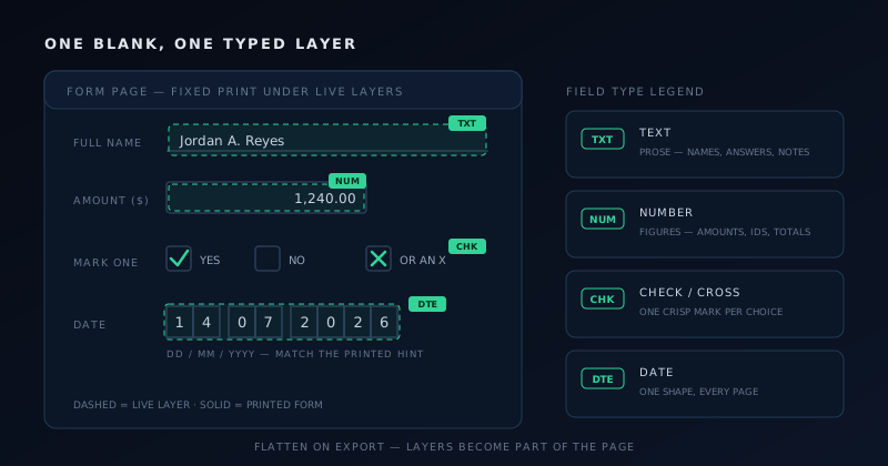
The convention question (day first or month first) is one the software cannot answer for you, and I never guess. A United States federal form wants month, day, year; most forms from everywhere else want day first; anything international or archival increasingly wants the unambiguous year-month-day ordering. I look for the printed hint, which is usually a tiny “MM/DD/YYYY” or “DD.MM.YYYY” under the line, and match it exactly. When there is no hint, I write the month as a short word, because “14 Jul 2026” cannot be misread in either direction and no reviewer has ever rejected a form for being too clear.
Segmented date boxes (those rows of individual cells for each digit) are a placement exercise rather than a typing exercise. One wide date field stretched across the cells rarely lands each digit where it belongs, so I either use Courier to get predictable per-character spacing or place small individual fields per cell group when the form is strict about it. It is slower, and it is the difference between a form that scans cleanly through the recipient’s intake process and one that gets kicked back for manual handling.
Check marks, cross marks, and choose-one questions
Boxes that want a mark instead of a value get the check or cross layer, and the first decision is which glyph the form asks for. Plenty of official paperwork instructs “mark with an X,” and giving it a tidy check mark instead is technically an answer and practically a deviation. I read the instruction line once, pick the matching mark, and then keep that choice identical for every box on the document. Mixing checks and crosses on one form reads as two different people filling it, which is not the impression a signed declaration should give.
The subtler situation is the choose-one group: a printed row of circles or boxes where exactly one option may be selected. Interactive PDF forms solve this with radio buttons that enforce exclusivity in software; PDF Studio does not have a separate radio widget, and I have come to prefer the honesty of that. I place a single mark on the chosen option and deliberately leave the others empty, and the discipline of choosing exactly one is mine rather than the tool’s. What the editor does guarantee is that the mark I place is crisp, sized to the printed circle, and positioned dead center instead of straddling two options.
Grids are where marks multiply: a matrix of rows and columns where each row needs its own selection. Placing thirty individual marks by eye produces thirty slightly different marks, so I build one perfect mark first, sized and centered against the top-left cell, and then duplicate it down the grid, shifting each copy into its row. Duplication preserves the exact dimensions, which keeps the column visually straight in a way freehand placement never quite manages. On a dense grid, that straight column is the difference between a form that looks machine-processed and one that looks rushed.
One warning from experience: a mark that overlaps the printed label of the adjacent option is worse than useless, because it creates genuine ambiguity about which answer was intended, and an ambiguous selection on a legal or benefits form triggers a follow-up letter at best. Before export I zoom into every marked group and confirm that each mark touches only its own box. Thirty seconds of squinting is cheap insurance against a three-week correction cycle.
What the AI field scan decides about each blank
When I run the AI field scan on an uploaded form, it does more than find the blanks; it classifies them. A ruled line after a label comes back as a text field, a small square comes back as a check target, anything that pattern-matches a date arrangement comes back date-style, and an obvious signature line gets a signature target. On a cleanly structured digital form, that classification pass is the single biggest time saver in the product, because it spares me not just the dragging but the type-picking for the majority of fields. The full walkthrough of that workflow lives at Using the AI field scan to fill a PDF form fast.
I treat the scan’s type guesses exactly like I would treat a new assistant’s first attempt: probably right, worth checking. The misclassifications follow patterns. A numeric amount box often arrives as plain text because a blank rectangle carries no arithmetic hints. A date line without printed format cues gets read as ordinary text. Occasionally a decorative box around a heading is mistaken for a check target. None of these are disasters, because every scanned suggestion is an ordinary editable layer: I delete the wrong one, place the right type in the same spot, and move on.
My review pass for classifications is a single top-to-bottom read of the page before I type anything, sorting each suggested field into three buckets: right type and right place, right place but wrong type or size, and missing entirely. The first bucket I leave alone. The second I fix immediately, while the page context is in my head. The third becomes a short list of manual placements. Doing the whole triage before filling means I never pour a value into a field I am about to delete, which is the classic way to lose five minutes to a two-second mistake.
When a scan comes back genuinely noisy (a cramped form, an unusual layout, suggestions scattered like confetti), I clear only the AI fields and keep the document. That separation between clearing the scan and clearing the workspace is one of my favorite design decisions in the editor, because it makes experimenting with the scan free. A bad scan costs one click to undo; it never costs the upload, and it never touches fields I placed myself.
When I skip the scan and place fields by hand
Some documents earn manual placement from the first minute. Scanned raster pages are the obvious case: the scan reasons about digital structure, not photographs, so a form that exists as an image needs its fields hand-built regardless. Dense government layouts with three columns of tiny boxes are another, because correcting forty near-miss suggestions takes longer than placing twenty deliberate fields. And any high-stakes single-page document (a contract signature page, a bank mandate) gets manual treatment simply because I want to have consciously decided every field on it.
The manual toolset is the same regardless of how a field was born: place, move, resize, duplicate, delete, and style with font, size, color, and exact position. Duplication is the power move for repetitive forms: build one field with the right type and dimensions, then copy it down the page so every instance matches. The complete hands-on technique, including alignment habits for cramped layouts, is covered in Placing and styling PDF fields by hand: text, numbers, checks, dates, and it is worth an evening of practice because manual speed is what makes the scan optional rather than essential.
Choosing the type by hand forces a useful clarity that the scan sometimes papers over. Standing over each blank for half a second and asking “what shape of answer does this want” catches form ambiguities early: the blank that could be a date or a reference number, the box that might be choose-one or tick-all. When the printed form itself is ambiguous, I resolve it before filling, by reading the instructions or checking the issuing agency’s guidance, rather than encoding my guess into a signed document.
- Prose of any kind (names, addresses, descriptions) gets a text field sized to the printed line.
- Anything with arithmetic or identity consequences (amounts, totals, account numbers) gets a number field and a second look.
- Tick boxes get a check or cross layer matching the form’s instruction, one mark per group for choose-one questions.
- Dates get the date-style field, in the exact format the form prints as a hint.
- Signature lines get the signature layer, never a cursive-looking text field.
Flattening on export, and why it matters
While I work, every field is a live layer floating over the document, movable, restyleable, deletable. Export changes its nature. When I download or print from PDF Studio, the layers are committed into the page itself, producing one finished, flattened document in which my typed name, my marks, and my drawn signature are simply part of the PDF the way printed ink is part of paper. Nothing about the output invites further editing, and that is precisely the property a completed form should have.
Flattening matters for three practical reasons. First, fidelity: the recipient sees pixel-for-pixel what I reviewed, with no dependence on their PDF viewer’s form-rendering quirks. Second, stability: a flattened answer cannot be accidentally nudged, cleared, or tabbed-through by someone opening the file downstream, which live form widgets absolutely can. Third, print behavior: flattened content prints exactly as displayed, whereas interactive fields sometimes vanish or shift on printers driven by older software. A form that must survive an unknown chain of viewers, printers, and intake systems should travel flat.
The one discipline flattening demands is version hygiene, because the exported file is not a live form I can reopen and adjust field by field. My original blank stays untouched on disk, and if a value needs to change after export, I return to the editor, fix the layer, and export a fresh copy rather than trying to doctor the finished file. The flattened export is the end product; the source PDF plus my working session is the project. Keeping those roles straight means a correction costs one minute instead of a rebuild.
My closing ritual is always the same, and it is the same one the beginner walkthrough at How to fill and sign a PDF form with Novus PDF Studio teaches: review every layer in the editor, export, then open the downloaded copy cold and read it as the recipient will. Field types get the answers into the right shape, the scan gets them there fast, manual placement gets them there precisely, and the flattened export is the moment all of it becomes a document I am willing to put my signature under.
Frequently asked questions
Quick answers to common questions about this topic.
What field types does Novus PDF Studio support?
The live editor supports text fields for prose, number fields for figures, check and cross marks for boxes and choose-one questions, date-style fields for consistent dates, and signature fields for drawn signatures. Every field is an editable layer with font, size, color, position, and dimension controls, and the same toolset applies whether the field came from the AI scan or was placed by hand. Styling uses the export-safe built-in fonts (Helvetica, Times Roman, and Courier), so the finished document renders identically wherever it is opened.
Does the AI scan pick the field type automatically?
Yes. The scan classifies each blank it finds, proposing text fields over ruled lines, check targets over small squares, date-style fields over date-like patterns, and a signature target over the signature line. The classification is a starting point, not a verdict: amount boxes are sometimes read as plain text and unlabeled date lines can be misread, so review each suggestion before filling. Every scanned field is an ordinary layer you can retype, resize, or replace, and you can clear only the AI fields if a scan misfires.
How do I handle radio-button style choose-one questions?
PDF Studio does not include a separate radio-button widget that enforces exclusivity, so choose-one groups are handled with a single check or cross mark placed on the selected option while the other options stay empty. Match the glyph to the form’s instruction (some paperwork explicitly asks for an X), keep the same mark style across the whole document, size the mark to the printed box, and zoom in before export to confirm no mark overlaps a neighboring option’s label, since an ambiguous selection is the fastest route to a rejected form.
What does flattening on export actually do?
Export commits every layer (typed values, marks, dates, and the drawn signature) into the page itself, producing a single finished PDF where your answers are fixed content rather than live, editable form widgets. That guarantees the recipient sees exactly what you reviewed, prevents downstream viewers from accidentally altering a value, and makes printing predictable across old and new software. The trade-off is that the exported file is final: keep your original blank and fix mistakes by re-exporting from the editor, not by editing the flattened copy.
Do number and date fields validate what I type?
They keep the shape of your entries consistent (figures stay tidy and uniform across numeric fields, and every date on the form renders in the same style), but no field type can verify that a value is actually correct. The software cannot know whether a total sums properly or whether a reference number matches its source, so audit numeric layers as a class before export and match the date convention the form prints as a hint, writing the month as a short word when no hint exists.
Related workflow
Any document to a signed, sendable PDF
A form that arrived as a scan, a DOCX or an image becomes a filled, signed PDF small enough to email, without a single upload to someone else’s server.
- Bring the source into PDFNovus Convert: Images, documents and ebooks all land as PDF here, so the editor downstream only ever sees one format.
- Fill the fields and signNovus PDF Studio: The AI field scan proposes the boxes; every one stays editable, because a form editor that cannot be corrected is worse than no editor.
- Compress before sendingNovus Convert: Adjustable quality with the measured output size shown before download, so there is no guessing whether it cleared the limit.
Related troubleshooting
Was this page helpful?
Your answer stays in this browser, it is not sent anywhere and no account or cookie is involved.