Novus PDF Studio
Placing and styling PDF fields by hand: text, numbers, checks, dates
A hands-on guide to placing and styling PDF fields yourself in Novus PDF Studio: text, number, check or cross, and date-style layers, with precise position, font, size, and color control.
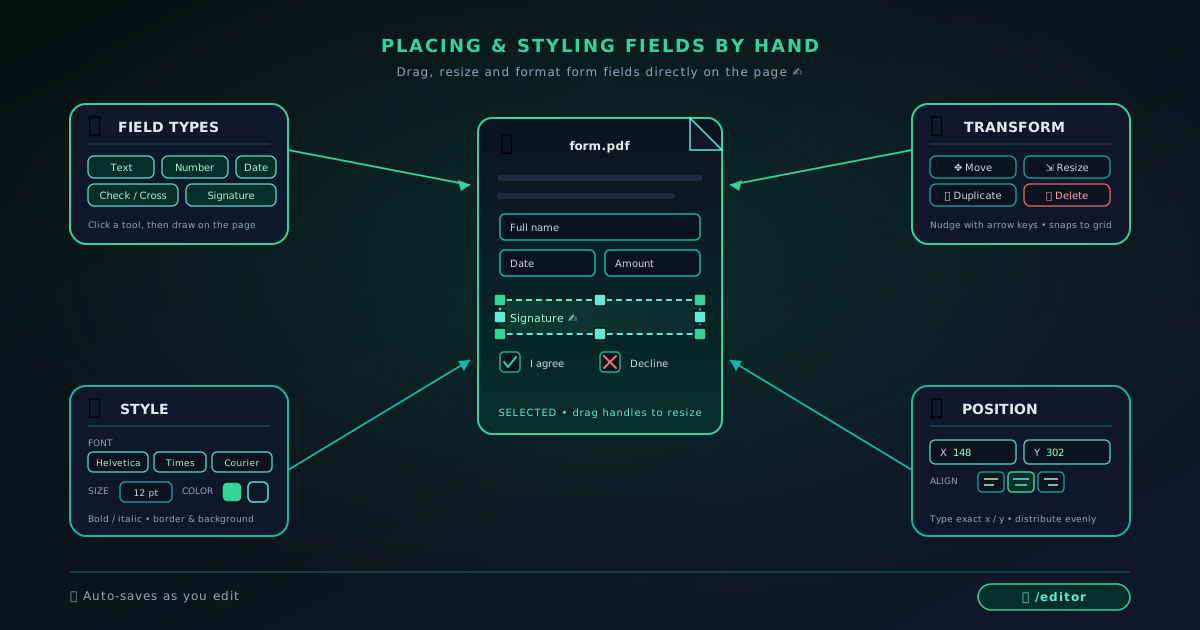
The AI field scan in Novus PDF Studio is a fast way to get most of a form roughly populated, but it is a first draft, not a finished layout. Sooner or later you will meet a form that the scan reads badly: a tight government box, a table with cramped columns, a checkbox grid, or a signature line squeezed against printed text. When that happens, placing fields by hand is not a fallback. It is the part of the job where you get the result exactly right, and it is worth learning as its own skill. This tutorial walks through the manual toolset end to end.
Everything below happens inside the live editor at pdf.novusstreamsolutions.com, which is a browser-based fill-and-sign workspace. It handles text, number, check or cross, date-style, and signature fields, and it lets you move, resize, duplicate, delete, and style each one. It does not compress, convert, OCR scanned paper, redact, or clean metadata. Those are simply not features today, so this guide stays inside what the tool actually does. If you want the quick automated starting point instead, read Using the AI field scan to fill a PDF form fast first, then come back here when a form needs real precision.
Contents
- 1.1. Open the editor and decide what “manual” means for this form
- 2.2. Place your first text field and set the box precisely
- 3.3. Style the text: font, size, and color that stay legible
- 4.4. Add number fields for amounts, IDs, and quantities
- 5.5. Place check and cross marks for yes/no and selections
- 6.6. Add date-style fields and align a full row
- 7.7. Duplicate, distribute, and run a final layout review
Two ways to finish
Build from a blank slate
Skip or clear the AI scan and place every field yourself when the form is dense, unusual, or high-stakes.
Refine on top of a scan
Keep the good AI-suggested fields, then hand-correct position, size, and style on the rest.
- 1
1. Open the editor and decide what “manual” means for this form
Start by uploading your document at pdf.novusstreamsolutions.com/editor. Once the page is on screen, make a deliberate choice before you place anything: are you building the whole field set by hand, or refining what the AI scan produced? Both are valid. On a clean, well-spaced form the scan usually saves time and you only touch a few layers. On a cramped or oddly printed form, a blank slate is often faster than fighting dozens of misplaced suggestions.
If you want the blank slate, run the “clear AI fields” action rather than clearing the whole workspace. That distinction matters. Clearing AI fields removes only the scan-generated layers and leaves your uploaded PDF and any manual work intact, so you never have to re-upload. Clearing the workspace resets everything. Keeping the two separate means you can experiment with the scan, throw it away, and start placing fields by hand without losing your document.
Whichever route you take, keep your original file untouched on disk and treat the editor as a working copy. You will export a fresh finished PDF at the end, so there is no reason to overwrite the source. If you are brand new to the tool, the broader flow is covered in How to fill and sign a PDF form with Novus PDF Studio, and the field reference lives in Novus PDF Studio.
- Upload at pdf.novusstreamsolutions.com/editor and keep the source file untouched.
- Use “clear AI fields” to start blank without losing your uploaded PDF.
- Decide up front: full manual build, or hand-refine the scan.
Manual field work is a loop: place the box, set position and size, then style the text. - 2
2. Place your first text field and set the box precisely
Text fields are the workhorses of any form: names, addresses, reference numbers, notes, and free-form answers all live in them. Add a text field and drop it roughly over the blank space it belongs to. Do not worry about perfection on the first placement; getting it near the target is enough, because you will refine the box in the next moment using the position and size controls rather than by eye.
The goal is for the field box to sit inside the printed line or cell, not on top of the label. On a ruled form, the baseline of your text should land just above the printed rule, with a small margin of space on the left so the first character is not jammed against a border. Resize the box so its height comfortably fits the font size you plan to use: too short and characters clip, too tall and the text floats awkwardly in the middle of an empty rectangle.
Take advantage of exact position values when a form is unforgiving. Nudging a field by a couple of units left or down is far more reliable than dragging with a mouse, especially near the edges of a page. When you have one text field sitting perfectly, you have effectively calibrated the look for the rest of the form, and every field after this one gets faster.
- Drop the field roughly, then correct it with position and size values.
- Keep the box inside the printed line or cell, not over the label.
- Leave a small left margin so the first character is not crowded.
- 3
3. Style the text: font, size, and color that stay legible
With a box placed, open the style controls and choose a font. PDF Studio offers the three classic PDF-safe families (Helvetica, Times Roman, and Courier) and each has a job. Helvetica is the clean default for most modern forms. Times Roman suits formal or legal documents that already use a serif face, so your entries blend in. Courier is monospaced, which makes it genuinely useful for fields where every character should occupy the same width, such as reference codes or account strings printed into fixed-width boxes.
Size is where legibility is won or lost. Match the size to the printed text around the field so your answers do not look pasted in. If the form uses roughly ten-point labels, a similar size for your entries reads naturally. When a box is short, drop the size a point or two rather than letting characters clip at the top and bottom. It is better to have slightly smaller text that fits cleanly than larger text that collides with a printed rule.
Color should almost always be a strong dark tone: near-black or a deep blue that reads clearly on white and survives printing and scanning. Reserve any lighter color for cases where you deliberately want an entry to look like an annotation rather than an official value. Set the style once on a representative field, get it right, and you will reuse those exact settings across the whole document in the next steps.
- Helvetica for clean forms, Times Roman for formal documents, Courier for fixed-width codes.
- Match font size to the surrounding printed text; shrink slightly before you let text clip.
- Use a strong dark color that survives both printing and scanning.
- 4
4. Add number fields for amounts, IDs, and quantities
Number fields carry the values people scrutinise most: totals, salaries, invoice amounts, phone numbers, account IDs, and quantities. Place them the same way you placed text, but pay closer attention to horizontal alignment. In a column of figures, right-aligning the box edges so the values line up on their last digit makes the whole form easier to read and check, the way a spreadsheet or ledger would present them.
Courier earns its keep in number-heavy layouts. Because every glyph is the same width, columns of monospaced digits stack into tidy vertical rules with no ragged edges, which is exactly what you want in a table of amounts or a grid of reference numbers. For a single stray total on an otherwise text-based form, Helvetica keeps it consistent with everything else. Choose based on whether the number sits alone or belongs to a column.
Keep the box a touch wider than the longest value you expect. A field sized only for four digits will look cramped the day someone enters a five-digit figure or adds a currency symbol and a decimal. A small amount of breathing room now prevents an ugly clip later, and it costs you nothing in a form that already has the space.
- Right-align number boxes in a column so values line up on the last digit.
- Prefer Courier for stacked figures; keep single totals consistent with the form.
- Size the box for the longest realistic value, not the shortest.
- 5
5. Place check and cross marks for yes/no and selections
Checkboxes and option grids are where sloppy placement shows most, because a mark that drifts even slightly reads as ambiguous: did they tick this box or the one beside it? Use the check or cross field, and center it inside the printed square rather than letting it spill over an edge. On a tight grid, set exact positions so each mark sits in the same relative spot within its box, which gives the finished form a deliberate, consistent look.
Size the mark to fill most of the square without touching the border. A mark that is too small looks tentative and can be missed; one that is too large bleeds into neighbouring options and creates doubt. Aim for a mark that occupies most of the interior with a thin margin of white all around it, so the reader has zero uncertainty about which option you chose.
For yes/no pairs and multi-select lists, place one mark perfectly, then reuse it, because the duplication approach in the next step turns a single well-placed check into a whole clean column. Get the first one centered and correctly sized, because every copy inherits its quality, good or bad.
- Center each mark inside its printed square; do not let it cross the border.
- Size the mark to fill most of the box with a thin white margin.
- Perfect one mark, then duplicate it for the rest of a grid.
- 6
6. Add date-style fields and align a full row
Dates appear on almost every form (issued, signed, due, effective) and they read best when they follow the form’s own convention. Use a date-style field and enter the value in the format the printed labels imply, whether that is day-month-year, month-day-year, or a spelled-out month. If the form splits a date across separate day, month, and year boxes, treat each box as its own small field and place three tidy entries rather than forcing one string across the divisions.
Alignment across a row is what separates a professional-looking form from a hurried one. When a date sits alongside a name and a reference number on the same line, set all three fields to share a common baseline so the row reads as a single band of text instead of a staircase. Matching the vertical position values across the row is the fastest way to achieve that, and it is far more precise than trying to eyeball three separate boxes into agreement.
Give date fields a little horizontal room too, since a fully written date is longer than people expect. A box sized for a short numeric date will clip the moment you type a longer format. Once one date field looks right, it becomes the template for the others, and the final signing and export stage covered in Drawing a signature and exporting a finished PDF goes smoothly because the layout beneath it is already clean.
- Match the form’s date format; use separate fields for split day/month/year boxes.
- Share one baseline across a row so name, date, and reference align.
- Leave horizontal room for longer written date formats.
- 7
7. Duplicate, distribute, and run a final layout review
Manual placement pays off fastest through duplication. When a form repeats a field down a column (a line-item table, a list of dates, a stack of checkboxes), build one field to perfection, then duplicate it and move each copy into place. Every duplicate carries the same size, font, and color, so a whole column inherits the styling you set once. This is dramatically faster and far more consistent than hand-building each field from scratch, and it keeps repeated rows visually identical.
To distribute copies evenly, work with exact position values instead of dragging. If your first row sits at a known vertical position and the next row is a fixed distance below it, stepping each duplicate by that same increment produces perfectly even spacing. The same trick works horizontally across the columns of a table. Even, predictable gaps are the single biggest signal that a form was filled with care rather than rushed.
Before you consider the layout finished, sweep the whole document once. Look for fields that sit slightly too high or too low, boxes that overlap a printed rule, duplicates you forgot to move, marks that drifted off-center, and any empty field that should hold a value. Delete anything stray. This tool is a fill-and-sign editor, not a redaction or metadata-cleanup utility, so this visual pass is your quality gate: when it looks right, you are ready to add a signature and export the finished PDF.
- Perfect one field, then duplicate it to build repeated rows and columns.
- Step copies by a fixed position increment for perfectly even spacing.
- Do a full visual sweep for drift, overlap, and empty fields before export.
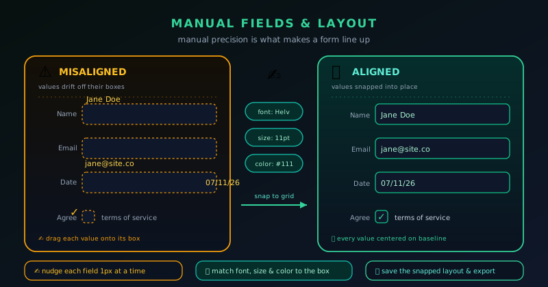
Style one field well, then let duplication do the work
The fastest manual layouts come from calibration, not repetition. Get one representative field exactly right (box, position, font, size, and color) then duplicate it across the form so every copy inherits that quality. You spend your effort once and reuse it everywhere, which keeps the whole document consistent and cuts the time to a clean result.
Frequently asked questions
Quick answers to common questions about this topic.
How do I place a form field exactly where I want it in a PDF?
Drop the field roughly over the target, then use the position and size controls to set precise values. Nudging by exact units is far more reliable than dragging, especially in tight boxes or near a page edge.
Which font should I use for PDF form fields?
PDF Studio offers Helvetica, Times Roman, and Courier. Use Helvetica for most modern forms, Times Roman to blend into formal or legal documents, and Courier for fixed-width codes and columns of numbers where consistent character width helps.
How do I make repeated fields line up neatly?
Build one field perfectly, duplicate it, and move each copy using exact position values stepped by a fixed increment. Every duplicate inherits the same size, font, and color, so rows and columns come out evenly spaced and identical.
Can Novus PDF Studio redact or clean metadata after I place fields?
No. The editor is a fill-and-sign field workspace. It does not redact, clean metadata, compress, convert, or OCR files, so your final visual review is the quality check before you export.
Related workflow
Any document to a signed, sendable PDF
A form that arrived as a scan, a DOCX or an image becomes a filled, signed PDF small enough to email, without a single upload to someone else’s server.
- Bring the source into PDFNovus Convert: Images, documents and ebooks all land as PDF here, so the editor downstream only ever sees one format.
- Fill the fields and signNovus PDF Studio: The AI field scan proposes the boxes; every one stays editable, because a form editor that cannot be corrected is worse than no editor.
- Compress before sendingNovus Convert: Adjustable quality with the measured output size shown before download, so there is no guessing whether it cleared the limit.
Related troubleshooting
Was this page helpful?
Your answer stays in this browser, it is not sent anywhere and no account or cookie is involved.