2026 · Novus Stream Solutions (hub)About 13 min readNovus Stream Solutions
Pricing page teardowns: what actually works
I keep a folder of pricing page screenshots the way other people keep recipes. After tearing down dozens, the patterns are consistent: the pages that convert respect the reader, and the ones that leak trust get clever. Here is what works (anchoring, honest decoys, buyer-shaped plan names, a truthful annual toggle), and the dark patterns to refuse.
Contents
- 1.Overview
- 2.Anchoring: the first number does the framing
- 3.Plan names a buyer can self-select into
- 4.The decoy effect, used honestly
- 5.The annual toggle that tells the truth
- 6.FAQs that de-risk instead of deflect
- 7.Dark patterns: the expensive kind of clever
- 8.What the best pages share
- 9.Tearing down your own page
Overview
I collect pricing pages the way some people collect vinyl. A folder of screenshots, organized by year, going back a long while now (SaaS tools, courses, hosting companies, the occasional sauna manufacturer) captured whenever a page either persuaded me or repelled me fast enough to be interesting. The tools I run are free and ad-funded, which makes this look like a strange hobby, but the model behind Free-first, ad-supported: delivering paid-tier features without a paywall was itself a pricing decision, and pricing literacy is how it got made with open eyes rather than by temperament.
Reading a few dozen of these side by side does something no single page can: patterns separate from brands. The pages that convert (and occasionally a founder shares numbers that let me check my guesses) are not the clever ones. They are the ones that let a stranger with a task answer three questions in under a minute: what does this cost me, what exactly do I get, and what happens if I am wrong about needing it. The pages that leak are the ones optimized against the reader: pressure where information should be, vagueness where numbers should be.
What follows is the distilled teardown, the recurring structures on the pages that work: anchoring done with real plans, names a buyer can self-select into, the decoy effect in its honest form, an annual toggle that tells the truth, FAQs that actually de-risk, and then the catalogue of dark patterns, because half of learning what works is learning what quietly costs more revenue than it captures. Names are omitted throughout; the patterns matter and the specific vendors do not.
Anchoring: the first number does the framing
Nothing on the page works harder than the first price the eye lands on, because every later number is judged relative to it rather than on its own. The mechanism is anchoring, one of the most replicated effects in decision research, and pricing pages exploit or fumble it mostly through ordering. Enterprise-first ordering makes the $290 tier the lens, and $49 subsequently reads like a bargain; cheapest-first makes $9 the lens, and the same $49 reads like a splurge. Neither ordering is dishonest. What separates the good pages is that the anchor is a real product some buyers genuinely purchase, doing double duty: framing the mid tier while actually serving the top of the market.
The fumbles are instructive. Pages that anchor with a crossed-out fake price ($199 forever slashed to $49) get the arithmetic of anchoring and miss its precondition, credibility; a visitor who suspects the anchor was invented re-prices everything on the page with suspicion as the multiplier, and suspicion is expensive. The other fumble is anchoring on a number the buyer never compares against: a per-seat price when buyers think in team totals, a monthly figure for a tool bought once a year. The anchor has to sit in the same mental currency the buyer is already counting in, or it frames nothing.
The honest deployment, which I unpacked more generally in Pricing psychology, used honestly, is to decide which comparison you want the buyer to make and make it easy (against your real top tier, against the cost of the problem, against the competitor’s total) rather than to manufacture a comparison that flatters you. On the best pages in my folder, the anchor is often not a price at all but a cost: one line above the grid quantifying what the status quo burns per month. When the page opens with the problem’s price, the product’s price walks in pre-framed, and nobody had to invent anything.
Plan names a buyer can self-select into
Cover the prices on a good pricing page and the plan names alone still route most visitors correctly: Freelancer, Studio, Agency. Cover them on a weak page and you learn nothing: Bronze, Silver, Gold ranks the plans without describing anyone, and Basic, Plus, Premium mostly describes the vendor’s margins. The test I apply in every teardown is self-selection: can a stranger point at the plan that is "them" within five seconds of reading only the names? Buyer-shaped names pass it; metal-shaped names fail it and push the routing work down into the feature table, where far fewer visitors are willing to follow.
The naming choice is really an information-architecture choice, because names carry the segmentation the vendor actually believes in. Named-by-buyer plans (Solo, Team, Agency) say the tiers map to situations; named-by-limit plans (10 projects, 100 projects) say the tiers map to consumption, which is honest for genuinely usage-shaped products of the kind compared in Usage-based vs seat-based pricing for software; named-by-flattery plans (Starter, Pro, Elite) mostly say the vendor hopes ego will do the routing. Getting this wrong costs more than conversion: buyers who self-select into the wrong tier come back later as support tickets and churn statistics.
One structural note the good pages share: whatever the names, there are three or four of them, not six. Choice overload is not a myth on pricing grids (every added column dilutes the self-selection test and multiplies the feature table’s rows), and the pages that convert treat extra segments as separate pages, a visible enterprise link or a hidden legacy tier, rather than additional columns. The name is the first act of the sale: it tells the visitor which story on this page is about them, and a visitor who has found their story keeps reading with different eyes.
The decoy effect, used honestly
The decoy effect (asymmetric dominance, in the literature) is the finding that adding a third option can move buyers between the original two. The classic demonstration is a magazine’s pricing: web-only for $59, print-only for $125, print-plus-web for $125. Almost nobody buys print-only, and that is not its job; its job is to make the bundle at the same price look self-evidently superior, and its presence measurably shifts buyers toward the expensive option. Once you know the shape, you spot it on a third of the pricing pages you tear down: a middle or side option whose real function is to make another option legible.
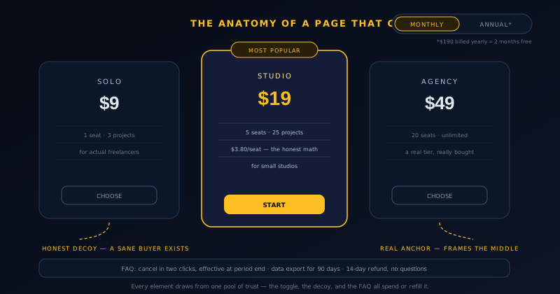
What separates honest use from manipulation is one question: is the decoy a real plan a sane person might correctly buy? An honest decoy is a genuine offering with a coherent audience whose secondary effect is framing: the single-seat plan a lone freelancer truly needs, which also happens to make the five-seat plan’s per-seat math look generous. A dishonest decoy is a fabricated non-choice: crippled on purpose, priced to be refused, existing only to shove. Buyers cannot always articulate the difference, but they can feel it, and the feeling (this page is playing me) arrives precisely at the moment a credit card was coming out.
Done well, the honest version is simply good design rather than a tolerated trick: real buyers exist at more than one size, and arranging true options so their relative value is instantly legible is exactly what a pricing page is for. The teardown tell is arithmetic (when the middle plan’s per-unit cost is dramatically better than its neighbor’s for no structural reason, someone tuned the neighbor into a decoy), and the design cure is to make every plan the obviously correct choice for the segment its name describes. If one of your plans has no imaginable correct buyer, delete it; the frame it provides is not worth the trust it spends.
The annual toggle that tells the truth
Nearly every SaaS page now carries the monthly/annual toggle, and it has become my fastest single tell for the character of the whole page. The truthful version: the toggle’s default state is clearly labeled, the annual price is shown as what it is ("$290 billed annually, works out to $24/month"), and the savings claim matches the arithmetic. The corrosive version: the page silently defaults to annual, displays "$24/month" in large type with "billed annually" in eight-point gray, and lets the buyer discover the twelve-times charge at checkout. Same discount, opposite outcomes: one converts a buyer, the other manufactures a chargeback.
The pattern among honest pages is consistent: state both real numbers adjacent to each other, put the default where the buyer’s risk is lowest or be explicit when defaulting to annual, and quantify the discount as months; "two months free" outperforms "17% off" in every result founders have shared with me, because months are the currency subscribers actually think in. The strongest pages add the one sentence that costs nothing and de-risks everything: what happens if you cancel mid-year, stated plainly next to the toggle rather than buried in the terms.
The deeper point is that the toggle is where a page proves whether its discounts are payment terms or traps. An annual discount has a legitimate economic basis (twelve committed months are worth a real discount in reduced churn and upfront cash), and pages that present it as exactly that trade read as businesslike. Pages that use the toggle to sneak a 12× charge read as adversarial, and the adversarial reading does not stay contained: it re-colors the plan names, the testimonials, and the FAQ. Trust on a pricing page is a single shared pool, and every element draws from the same one.
FAQs that de-risk instead of deflect
By the time a visitor reaches the pricing FAQ, they are not researching the product; they are looking for reasons not to buy, and the FAQ’s job is to run out of them. The good ones read like the transcript of a hundred real sales conversations: they name the awkward questions in the buyer’s own words and answer with specifics: numbers, timelines, button locations. The weak ones read like a legal disclaimer wearing a friendly font: "Can I cancel?" answered with "You can manage your subscription in settings," which technically responds and completely fails to de-risk.
Across the folder, the FAQs on high-converting pages keep answering the same five fears, because buyers keep having them:
Notice what the five have in common: none is about the product’s capabilities. Capability questions got answered higher up the page; what remains is risk, and risk is answered with specificity, because vagueness is what fear metabolizes into. The one-sentence test for a pricing FAQ entry: after reading the answer, does the buyer know exactly what will happen, or merely that something will? Every "it depends" without a follow-up number, every "reach out to our team," is a leak in the page’s hull: small, invisible in analytics, and cumulative.
- "Can I cancel, and what does it actually take?" The honest answer names the exact path: two clicks in settings, no email, no phone call, effective at period end.
- "What happens to my data if I leave?" Export formats, retention windows, and what gets deleted, with dates attached.
- "What counts as a user, project, or credit?" The billing unit defined concretely, edge cases included: do viewers count, do archived projects count.
- "Will my price change later?" The grandfathering policy stated as a commitment, not a mood.
- "What if it doesn’t work for me?" The refund window and its real conditions, in numbers rather than "contact us."
Dark patterns: the expensive kind of clever
The catalogue of pricing dark patterns is well documented (the Deceptive Design project has been taxonomizing them for over a decade), and tearing down enough pages turns you into a fast detector. The card-first "free" trial that converts silently on day fifteen. The cancel flow that takes two clicks to enter and a phone call to exit. The countdown timer that resets at midnight for the next visitor. Contact-us-only pricing on a product that plainly costs thirty dollars. Plan limits quietly lowered after purchase, with existing customers "migrated" to worse terms. Each one works, in the narrowest sense: the metric it targets moves.
The case against them is not primarily moral; it is accounting with a longer horizon. A dark pattern harvests conversions from exactly the population most likely to churn angrily, refund loudly, and file the chargebacks that raise processor fees across the board: the cancel-by-phone trick in particular converts subscription revenue into dispute risk at a remarkable rate. Meanwhile the pattern teaches your genuinely happy customers to distrust you at renewal, review, and referral time. The narrow metric goes up; lifetime value, word of mouth, and support costs all quietly move the other way, unattributed, in other dashboards.
The structural insight from watching pages evolve across years of screenshots: dark patterns are what teams reach for when they cannot improve the actual offer, which makes them a diagnostic even from outside. They are also contagious internally: a company that tolerates the sneaky annual default soon acquires the sneaky cancel flow, because the argument "it works" has already won once. The pages that stayed clean across five years of my folder belong, without exception, to products that grew anyway, which is either survivorship bias or the entire point.
Tearing down your own page
The method turns inward with two cheap tests. The five-second test: show a stranger the page for five seconds, take it away, and ask what the product costs and which plan is theirs; pass–fail on anchoring and naming in one shot. The task test: hand someone a realistic scenario and an imaginary budget, then watch them navigate silently; the moment they scroll back up to re-check something, you have found a leak, because re-checking is what unanswered risk looks like from the outside. Neither test needs tooling, a research panel, or more than fifteen minutes.
Downstream numbers keep the teardown honest, because pages can charm observers and still leak at the till. The metric pairing that matters is pricing-page-to-checkout alongside checkout completion itself: a strong page feeding an abandoned checkout is a different disease from a leaky page feeding a strong checkout, and the interventions barely overlap; the checkout half is its own discipline, covered in Choosing a payment processor and cutting checkout abandonment. Watch the pair after every revision, and let a quarter pass before judging, because pricing changes echo through renewal cohorts on a delay.
Then schedule the teardown the way the strong pages evidently do: quarterly, with fresh eyes, against the checklist this post just walked. Anchor real, names self-selecting, decoys defensible, toggle truthful, FAQ specific, patterns clean. The uncomfortable version of the exercise is reading your own page in the voice of the person you were before you built the product: the one with a task, a budget, and no loyalty. That reader is the entire audience. Every structure in this teardown is just a way of taking their side early, before the market takes it for you.
Frequently asked questions
Quick answers to common questions about this topic.
What is price anchoring on a pricing page?
Anchoring is the tendency to judge every number against the first one seen, which makes the first price on the page the lens for all the others. Pages use it through ordering (showing the enterprise tier first makes the mid tier read as reasonable) and through context lines like the monthly cost of the problem being solved. The honest version anchors with a real plan that genuine buyers purchase or a truthful cost comparison; the dishonest version invents a crossed-out price that never existed, which buyers increasingly recognize and punish by distrusting the whole page.
What is the decoy effect, and is it always manipulative?
The decoy effect is when adding a third option shifts choices between the original two: classically, a print-only magazine tier priced identically to print-plus-web, existing to make the bundle look obviously superior. It is manipulative only when the decoy is fake: a deliberately crippled plan no sane person should buy, priced to be refused. When every plan on the grid is a coherent offering some real segment correctly chooses, arranging them so relative value is legible is just competent design. The test: can you name the buyer for whom each plan is the right answer?
Should a pricing toggle default to monthly or annual?
Either can be honest; what matters is disclosure. Defaulting to monthly puts the buyer’s risk lowest and lets the annual discount read as a genuine offer. Defaulting to annual is acceptable when the state is unmistakably labeled and the full billed-today amount appears next to the per-month framing: "$290 billed annually" beside "$24/month," never the second without the first. Quantify the discount as months free rather than a percentage, and state what happens on mid-year cancellation next to the toggle. Buyers who discover the real charge at checkout convert into refunds and chargebacks, not revenue.
What should a pricing page FAQ actually contain?
The five fears buyers reliably carry to the bottom of the page: how cancellation actually works, step by step; what happens to their data if they leave, with export formats and retention windows; what the billing unit concretely counts, edge cases included; whether their price is protected from future increases; and the refund window with its real conditions. Answer each with numbers and specifics rather than reassurance. The test for every entry: after reading, does the buyer know exactly what will happen? Vague answers deflect the question and leave the fear intact.
Which pricing dark patterns hurt a business most?
The ones that weaponize exit: cancel flows requiring phone calls, silent trial-to-paid conversions after a card was required up front, and hidden annual billing behind a per-month price. They damage most because they convert your least committed customers into disputes (chargebacks raise processor fees across all revenue) while teaching committed customers to distrust renewals and stop referring. Fake urgency timers and invented discount anchors follow close behind: they are cheap to detect, and once a visitor catches one lie, every claim on the page gets re-read with suspicion as the multiplier.
Related troubleshooting
Was this page helpful?
Your answer stays in this browser, it is not sent anywhere and no account or cookie is involved.