2026 · Novus Stream Solutions (hub)About 13 min readNovus Stream Solutions
How to write a tutorial people actually finish
A tutorial that nobody finishes is a promise you broke politely. After writing more than sixty of them for our own tools, I have a firm view on what separates the finished from the abandoned: one scoped outcome, honest prerequisites, steps sized to single actions, screenshots placed where confidence dips, and a beginner test before publish.
Contents
- 1.Overview
- 2.Scope one outcome, and say it in the first two sentences
- 3.Prerequisites: the honesty section most tutorials skip
- 4.Step granularity: one action, one observable result
- 5.Screenshots vs text: place images where confidence dips
- 6.Write the failure paths, not just the happy one
- 7.Test it on a real beginner before you publish
- 8.Measure drop-off after you publish
- 9.The pre-publish checklist
Overview
Nobody publishes a tutorial expecting readers to bail at step four, yet that is the normal outcome. Scroll-depth data on instructional content is grim everywhere I have seen it: a large share of readers never make it past the first third, and only a small fraction reach the final step with a working result in hand. We maintain a library of sixty-plus walkthroughs for our own apps under Tutorials, and the early ones earned exactly that grim curve. The later ones do dramatically better, not because the writing got prettier, but because I stopped treating a tutorial as an article with numbers in it and started treating completion as the only metric that matters.
That reframe changes almost every decision. An article succeeds if it is read; a tutorial succeeds only if it is done, which means every sentence is either moving the reader toward a working result or giving them a reason to leave. The techniques below are the ones that measurably moved our completion numbers: scoping to one outcome, telling the truth about prerequisites, sizing steps to single actions, using screenshots where confidence dips rather than everywhere, writing the failure paths, testing on a genuine beginner, and instrumenting drop-off after publish. None of them require talent. All of them require deciding that a half-finished reader is a failure you own.
Scope one outcome, and say it in the first two sentences
The single biggest predictor of completion is scope. A tutorial that promises one concrete outcome (“export a transparent PNG from a phone photo”) gets finished; a tutorial that promises a topic (“mastering image editing”) gets skimmed and abandoned, because there is no finish line to reach. The test I apply before writing a word: can the outcome fit in one sentence, name an artifact the reader will possess at the end, and be achieved in one sitting? If the honest answer needs the word “and,” it is two tutorials. Splitting is nearly free in a content library; a bloated scope is paid for by every reader who starts it.
Declaring that outcome up front does double duty. It lets the right readers commit (people finish things they consciously decided to start) and it lets the wrong readers leave at sentence two instead of paragraph twelve, which is a service to them and to your analytics. Our best-performing walkthroughs open with the outcome, the time it takes, and what the reader will have at the end, in that order, before any background whatsoever. Background the reader needs gets woven in at the step where it becomes relevant; background the reader does not need gets cut or linked. A tutorial is not the place to demonstrate everything you know. It is the place to transfer one capability with as little friction as physics allows.
Prerequisites: the honesty section most tutorials skip
Half of tutorial abandonment is not boredom: it is ambush. The reader hits step five, discovers they needed an account, a paid plan, a specific browser, or forty minutes they do not have, and closes the tab with a small grudge against you. Every one of those ambushes was knowable at publish time, which is why the prerequisites block is the highest-leverage hundred words in the whole piece. State what the reader must have, what they must already know how to do, what it costs, and how long the whole thing takes, measured, not guessed, because authors reliably estimate half the true duration of their own instructions.
Honesty here feels commercially risky and is the opposite. Yes, “requires a desktop browser and about 25 minutes” turns some readers away at the top, but those readers were going to leave anyway, at the worst possible moment and with the worst possible impression. The readers who stay past an honest gate finish at far higher rates because nothing in the middle surprises them. We apply the same rule inside our products: our tools state their real model download sizes before you commit, and the tutorials inherit that posture. A prerequisite you disclose is a filter. A prerequisite you hide is a trap, and readers remember who trapped them.
One refinement that costs nothing: order the prerequisites by how likely each is to disqualify. Lead with the deal-breakers (the paid account, the desktop-only requirement, the forty-minute commitment) and leave “a modern browser” for last. Readers scan a prerequisite block top-down and bail at the first miss, so putting the most common disqualifier first means the wrong-fit reader leaves after one line instead of five. The ordering also keeps you honest with yourself: writing the deal-breaker at the top forces you to stare at it, and more than once that stare has sent me back into the product to remove the requirement rather than document it.
- Accounts, tools, and versions: name them exactly, with links, before step one.
- Assumed skills: “you can use a terminal” is a prerequisite, not a given.
- Money: any paid requirement goes at the top, never revealed mid-tutorial.
- Time: state a measured duration from a real test run, not an optimistic guess.
- Environment: OS, browser, or device constraints that will break steps later.
Step granularity: one action, one observable result
The unit of a tutorial is the step, and the rule that fixed ours is strict: one step equals one action the reader performs plus one result they can observe. “Open the export panel and choose PNG with transparency enabled, then confirm the preview shows a checkerboard” is three steps wearing one number, and compound steps are where readers silently fork away from you: they do the first half, miss the second, and nothing warns either of you until step nine fails mysteriously. Small steps feel patronizing to the author and feel like traction to the beginner, and the beginner’s vote is the one that counts.
The observable result half of the rule matters as much as the action half. After every consequential step, tell the reader exactly what they should now see: the button that appeared, the filename that changed, the checkerboard behind the cutout. These checkpoints are how a reader self-diagnoses within seconds instead of discovering at the end that something went wrong somewhere. They also carry the emotional load of a tutorial: each verified checkpoint is a small proof of progress, and progress that can be felt is the thing that carries a tired reader through steps seven to twelve. Number every step, keep one instruction per number, and never bury an action inside an explanatory paragraph where a skimming eye will miss it.
There is a number to watch once you write this way: total step count. Splitting compound steps honestly can balloon a walkthrough from nine steps to twenty, and a reader confronted with a wall of numbers judges the effort before reading a word of it. The fix is grouping, not re-merging. Leave every step atomic but gather them under three or four phase headings (set up, do the thing, verify, export) so the reader’s sense of progress operates at the phase level while their hands operate at the step level. Twenty steps under four phases reads as four milestones; the identical twenty in one undifferentiated column reads as a chore. Atomicity protects correctness, grouping protects morale, and a finished tutorial needs both. The phase names also hand your drop-off analytics natural checkpoints to segment by later.
Screenshots vs text: place images where confidence dips
The screenshot question is usually framed as style (some writers illustrate everything, some nothing) and it should be framed as targeting. A screenshot earns its place where the reader’s confidence dips: ambiguous interfaces with three similar buttons, checkpoints where they need to compare their screen against a known-good state, and any spatial instruction like “the handle in the lower-left of the canvas.” A screenshot of a simple confirmation dialog, or of the text you could have just written, adds scroll length and maintenance burden while teaching nothing. Our rule of thumb ended up around one image per three to four steps, clustered at the confusing parts, not evenly sprinkled.
Text holds the advantages people forget when they reach for the capture tool. Text is searchable, copyable, translatable, accessible to screen readers, and, decisively for anyone maintaining a library, cheap to update when the interface shifts. Every screenshot is a small liability with a shelf life: interfaces change, and an outdated image actively misleads in a way stale prose rarely does, because readers trust pictures over words. So annotate the screenshots you do keep (a single arrow or box beats a paragraph of spatial description), crop them tightly to the relevant region, caption them with what the reader should verify, and treat every one you can delete as future maintenance you just declined.
Write the failure paths, not just the happy one
A tutorial written only for the reader whose every step succeeds is written for a minority. Real readers hit the version mismatch, the button that is not where you said, the export that comes out black, and at that moment they make a binary choice: debug or abandon. Which way they go depends almost entirely on whether you anticipated the failure. A short “if you see X instead, it means Y; do Z” note at each step where your test runs went sideways converts a tab-close into a thirty-second recovery, and those notes are the cheapest completion percentage you will ever buy.
You do not have to imagine the failure modes, because your drafting process generates them. Every mistake you make while building the thing yourself, every hesitation about which of two menus to open, is a preview of a reader’s wrong turn: log them as you go instead of tidying them away. After publish, support questions and comments extend the list; each one is a reader who hit a wall and, unusually, told you about it, standing in for the dozens who hit the same wall silently. We fold those directly back into the walkthrough as troubleshooting notes, the same philosophy behind Designing a help mode that pulses the control you need: help placed exactly where the confusion happens, not in a separate FAQ the stuck reader will never visit.
Test it on a real beginner before you publish
You cannot proofread your own tutorial into working, because you are the one person on earth incapable of following it as written: your hands fill the gaps your words left, automatically and invisibly. The only trustworthy pre-publish test is watching an actual member of your audience attempt the tutorial cold, while you stay silent. The silence is the hard part and the entire point: the moment they scroll back, hesitate, or ask a question, you have found a defect, and answering out loud instead of fixing the text just patches this reader while leaving the trap armed for the next thousand.
One tester catches the majority of structural problems; two catch most of what remains; past three you are polishing. If recruiting a human genuinely is not possible for a given piece, two weaker substitutes recover some of the value: follow your own steps on a clean machine and fresh profile, where none of your logged-in state can secretly rescue you, or hand the text to an AI agent with access to the tool and watch where its literal reading diverges from your intent: machines share the beginner’s great virtue of doing what you wrote instead of what you meant. Neither replaces the human test. Both beat shipping on faith, which is what most tutorial publishing actually is.
Measure drop-off after you publish
Publishing is the midpoint of a tutorial’s life, not the end, because completion is measurable and the measurements tell you exactly where to operate. You do not need surveillance-grade analytics for this: scroll-depth thresholds tell you where reading stops, time-on-page distributions separate readers who worked through from readers who bounced, and if the tutorial produces a downloadable artifact or ends with a link to a next step, the click-through on that final element is the closest thing you get to a true completion count. Privacy-respecting, aggregate numbers are entirely sufficient: you are diagnosing a document, not tracking a person.
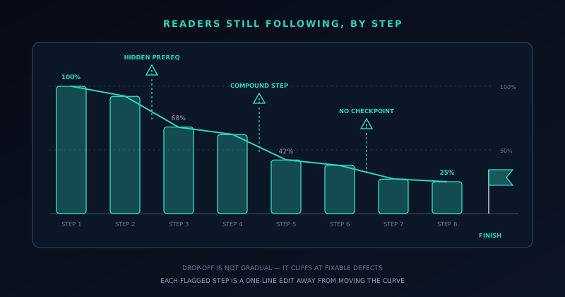
The pattern to hunt for is the cliff. Gradual decay along the page is the ordinary physics of attention, but a sharp drop concentrated at one step is a defect with an address: an ambush prerequisite, a compound step, a missing checkpoint, an instruction that no longer matches the interface after an update. Fix the step, ship the edit, and watch whether the cliff moves: this loop is the whole game, and it is why keeping tutorials in version control alongside code, as we argued in Content as code: running a 250-post blog without a CMS, pays off: editing a walkthrough is a one-line change and a deploy, not a CMS expedition. A tutorial is software. It has bugs, the bugs have locations, and drop-off data is the stack trace.
Set a re-test cadence too, because tutorials rot on the product’s schedule, not the calendar’s. The trigger that matters is any release touching a surface your steps walk through: a renamed menu, a relocated button, a changed default. We fold a five-minute tutorial pass into the release checklist itself (skim the affected walkthroughs, re-shoot the one screenshot that changed, correct the step text) because five minutes at release time beats the alternative, a slow bleed of support questions from readers following instructions the interface no longer matches. A tutorial library is a liability ledger as much as an asset list: every guide you publish is a promise to keep it true, and the cheapest moment to keep that promise is the moment you break it.
- Scroll depth by section: where does the audience thin out?
- A completion proxy: clicks on the final download, export, or next-step link.
- Support questions and comments mapped back to the step that caused them.
- Re-check after every product update: interface drift silently breaks steps.
The pre-publish checklist
Everything above compresses into a checklist I now run against every walkthrough before it ships, and handing it to you is the fastest way to end this piece: the outcome is one sentence naming an artifact, and it appears in the first two sentences. Prerequisites (tools, skills, cost, measured time) sit above step one with nothing withheld. Every step is one action with one observable result, and no action hides inside a prose paragraph. Screenshots cluster at the ambiguous moments, cropped and annotated, and none of them repeat what the text already says. The known failure points carry if-you-see-this notes. A real beginner has run the whole thing while I watched in silence, and the finish line (the working result in the reader’s hands) is stated plainly at the end so they know they have arrived.
The deeper habit behind the checklist is respect for the reader’s position. Someone attempting your tutorial has lent you their next half hour on the strength of a promise, usually while mildly frustrated at the thing they could not do alone, the same person we design first-run experiences for in The first-run experience: onboarding a tool nobody reads docs for, just one step further along in their willingness to be taught. Repay that with a finish line they actually reach and they return for the next guide, the next tool, the next thing you make; our tutorial library drives more durable traffic to our docs and apps than any category of post we publish. Waste it, and no amount of publishing cadence buys the trust back.
Frequently asked questions
Quick answers to common questions about this topic.
Why do most people abandon tutorials halfway through?
The big three causes are ambush prerequisites, compound steps, and missing checkpoints. Readers quit when they discover mid-tutorial that they need an account, a payment, or a tool nobody mentioned; when a single numbered step actually contains several actions and they silently miss one; and when nothing tells them what they should see after a step, so errors go unnoticed until everything fails at once. All three are fixable at the writing stage, which is why drop-off is best treated as a defect in the document rather than a defect in the reader.
How detailed should tutorial steps be?
One action per step, paired with one observable result. If a step contains “and,” it is usually two steps; if a reader cannot verify they did it correctly before moving on, it is missing its checkpoint. This granularity feels patronizing to the expert writing it and feels like traction to the beginner following it, and the beginner is the audience. Small, verifiable steps also make failures self-locating: when something breaks, the reader knows exactly which action to re-check instead of abandoning the whole attempt.
Are screenshots better than text in tutorials?
Neither wins universally: placement decides. Screenshots earn their place where confidence dips: ambiguous interfaces, spatial instructions, and checkpoints where readers compare their screen to a known-good state. Text wins for everything else because it is searchable, accessible, translatable, and cheap to update when the interface changes. Every screenshot is a maintenance liability with a shelf life, and an outdated image misleads more powerfully than outdated prose. A useful ratio in practice is roughly one tightly-cropped, annotated image per three to four steps, clustered at the confusing parts.
How do I test a tutorial before publishing it?
Watch a genuine beginner attempt it cold while you stay completely silent. Every hesitation, scroll-back, or question marks a defect in the text: fix the document, not the moment, because explaining out loud only rescues that one reader. You cannot test your own tutorial by rereading it; your hands automatically fill the gaps your words left. If no human tester is available, a clean machine with a fresh profile, or an AI agent following your literal wording, will catch a useful subset of the same problems.
How do you measure tutorial completion rates?
Use aggregate, privacy-respecting signals: scroll depth shows where reading stops, time-on-page distributions separate genuine attempts from bounces, and clicks on the final artifact (a download, an export, a next-step link) serve as the closest available proxy for true completion. The diagnostic pattern is the cliff: a sharp drop at one step points to a specific fixable defect, unlike the gradual decay that is normal for any long page. Fix the step, redeploy, and check whether the cliff moved.
Related troubleshooting
Was this page helpful?
Your answer stays in this browser, it is not sent anywhere and no account or cookie is involved.